September 30th, 2017 8:59pm

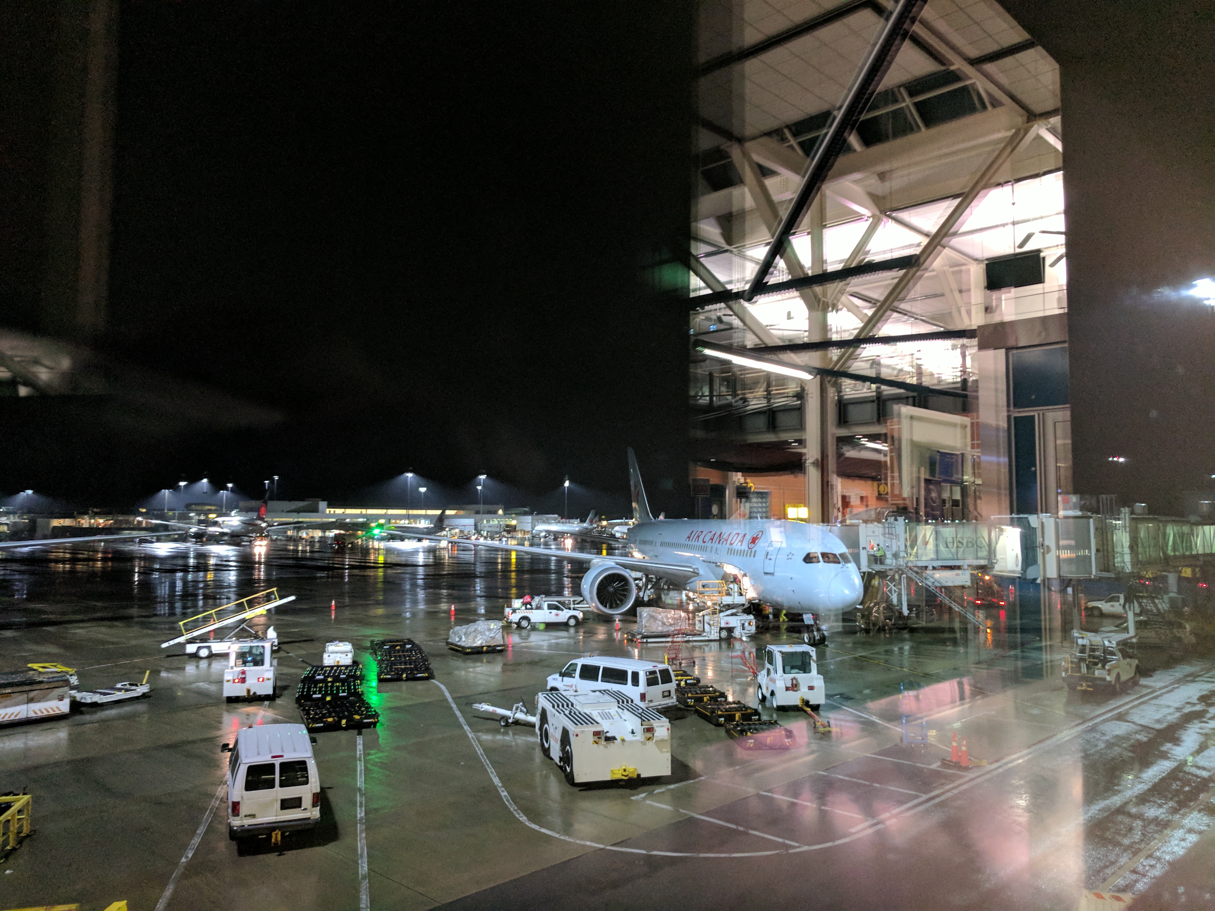
Heading to Amsterdam to talk at Fronteers Conf next week. I’m starting my journey from Brisbane after a looong day of packing and goodbyes. It’s a 23 hour trip, so I’m planning to front load as much sleep as possible, but will see how that goes.
Anywho, I’m off to find the duty free kiosk. Will connect back up in Abu Dhabi.
My first moments in Europe
October 2nd, 2017 5:36am
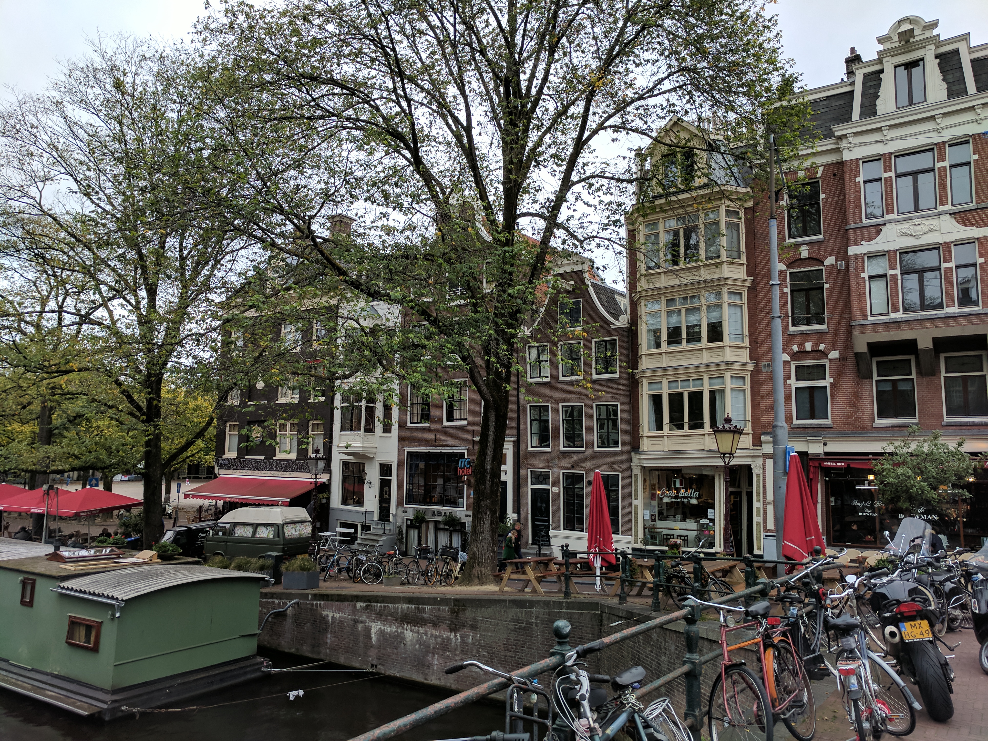

Arrived in Amsterdam at about 3 PM, after some 23 hours in transit. Thomas, one of the conference organizers, met me at the airport and shuttled me to my hotel despite my arriving super early. It was a nice gesture.
My hotel room is tiny. It was a deliberate thing I booked because it looked cute (it is), but I had to shift the mattress to the floor because I don’t fit on the bed otherwise.
After checking in, having a shower, and a change of clothes I went for a walk. I was really happy with myself to have found the Amsterdam sign with only a cursory glance at the map as I left the hotel.
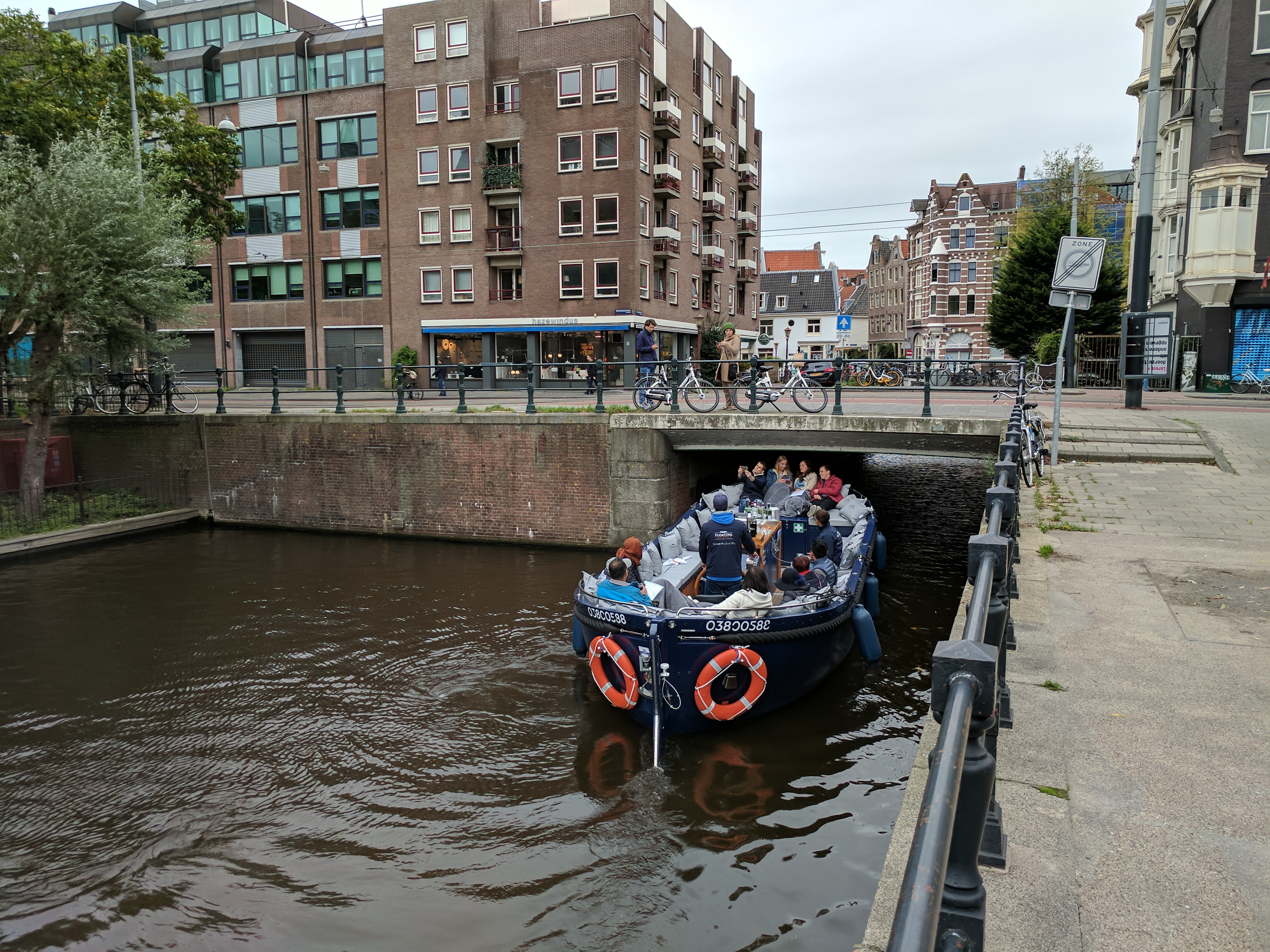
On the way there I saw a girl on a boat nearly get a concussion while passing under a ludicrously low bridge. Also there was also a game of polo going on nearby which isn’t something you see every day.
I kept walking, ended up getting lost in the Vondelpark before giving out to find a supermarket to pick up supplies. It was all in Dutch so I was excited to go around the produce aisles finding the the names of things I learned from Duolingo.
After that I had a burger and Sprite (it’s sugar-free here and tastes of lemons), then caught a tram back home because it’s getting late and despite my claims of not being jetlagged, I’m going to have an early one tonight because I’m exhausted.
Preparations for the conference
October 9th, 2017 7:52am
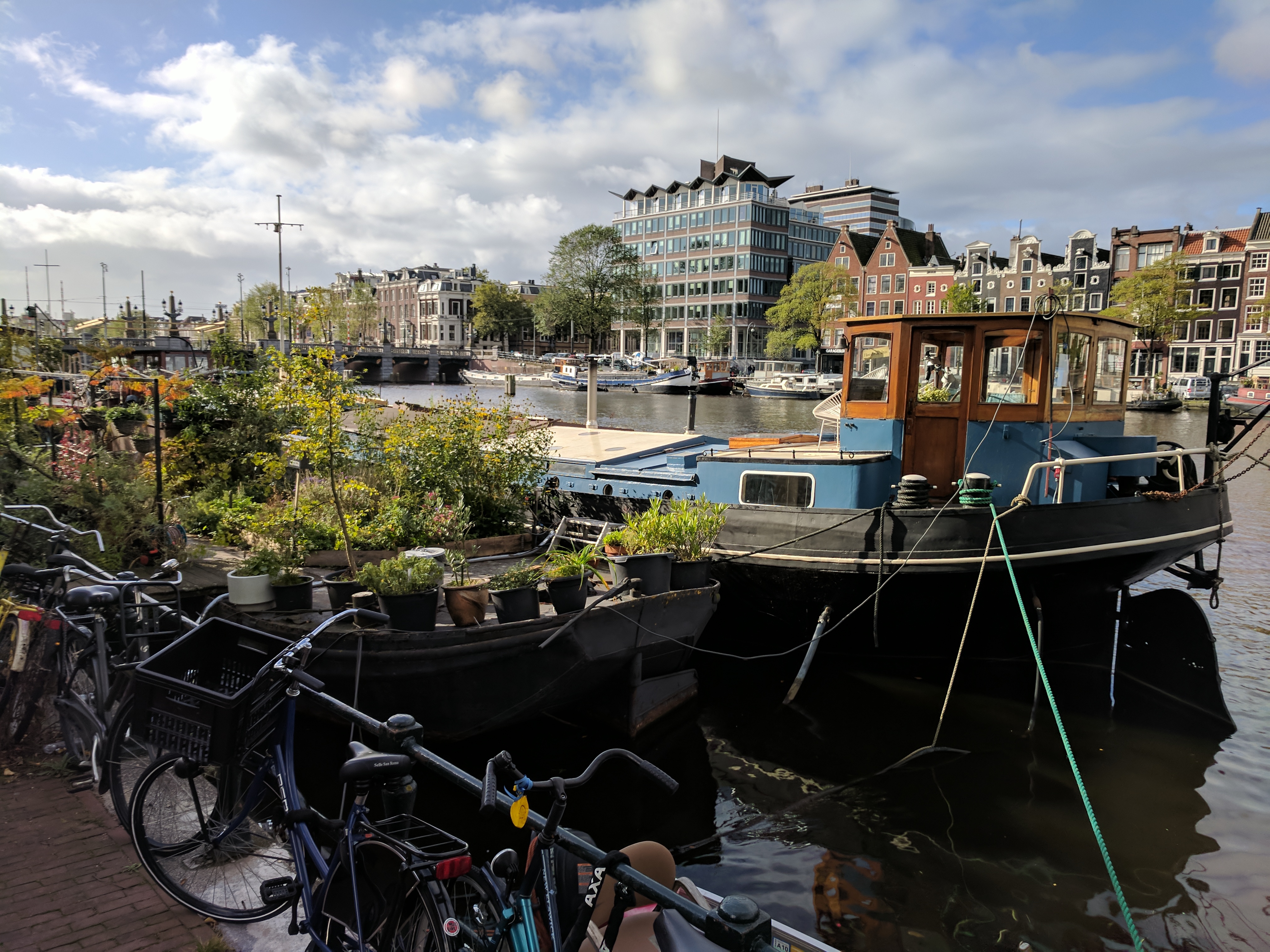
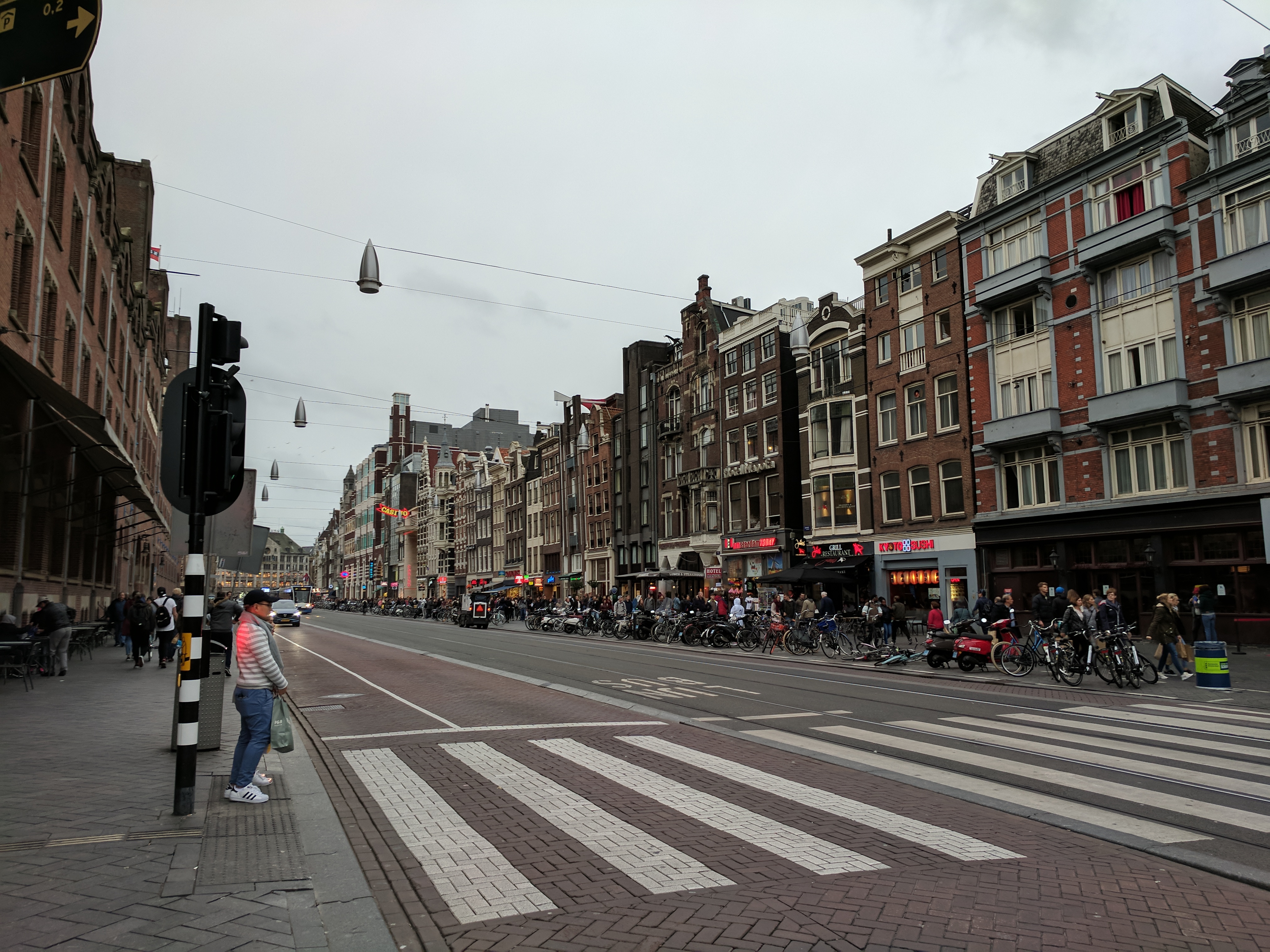

After my first day, things started to get busy. In preparation for my talk I spent a couple of days in the lovely The Thinking Hut, who charge by the hour and have fast Internet and a really sweet industrial chic. This meant I got to explore the Amsterdam Oost (East) neighbourhoods.
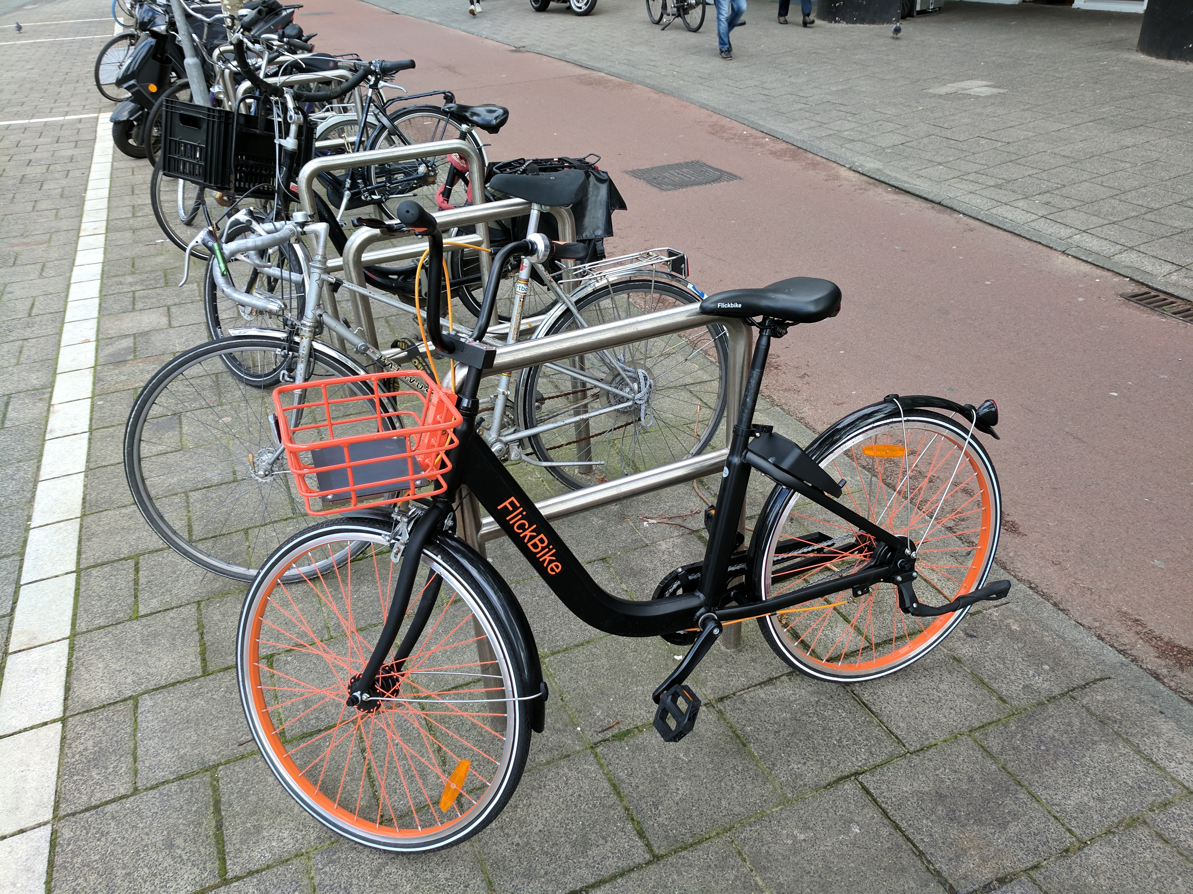
So I walked around, went to the botanical gardens, took a metro ride, hired a FlickBike then couldn’t find anywhere to park it, and ordered a vegetarian roti with egg from a suburban Indian kitchen in bad Dutch. I felt really good about that last one until it came time to pay and I realised I don’t know any numbers in Dutch. Oops.
Tuesday night was the NLHTML5 meetup, which I guess is kinda comparable to the defunct Web Design Group back in Brisbane. This meetup was resurrected from the dead by the industrious Paul VM especially so that it could run around Fronteers time, and was a cool crowd and a good way to ease into the tech festivities. There were three speakers; Ola talked about standards and how to report bugs, Stephanie went through how she built her awesome pixel art hardware project, and Martin talked WebVR which made me really want to build some VR projects of my own.
Wednesday night we had the speaker dinner at Pakhuis De Zwijger. We met in the hotel lobby and from there the organisers shepherded us onto a boat. This took us for a ride out the gracht (canal), down the Amstel river, and into the IJ to get to the venue. It was nice, we all got to know each other and network a bit. There were local folks and peeps from all over the world together in one place, and it was a good evening.
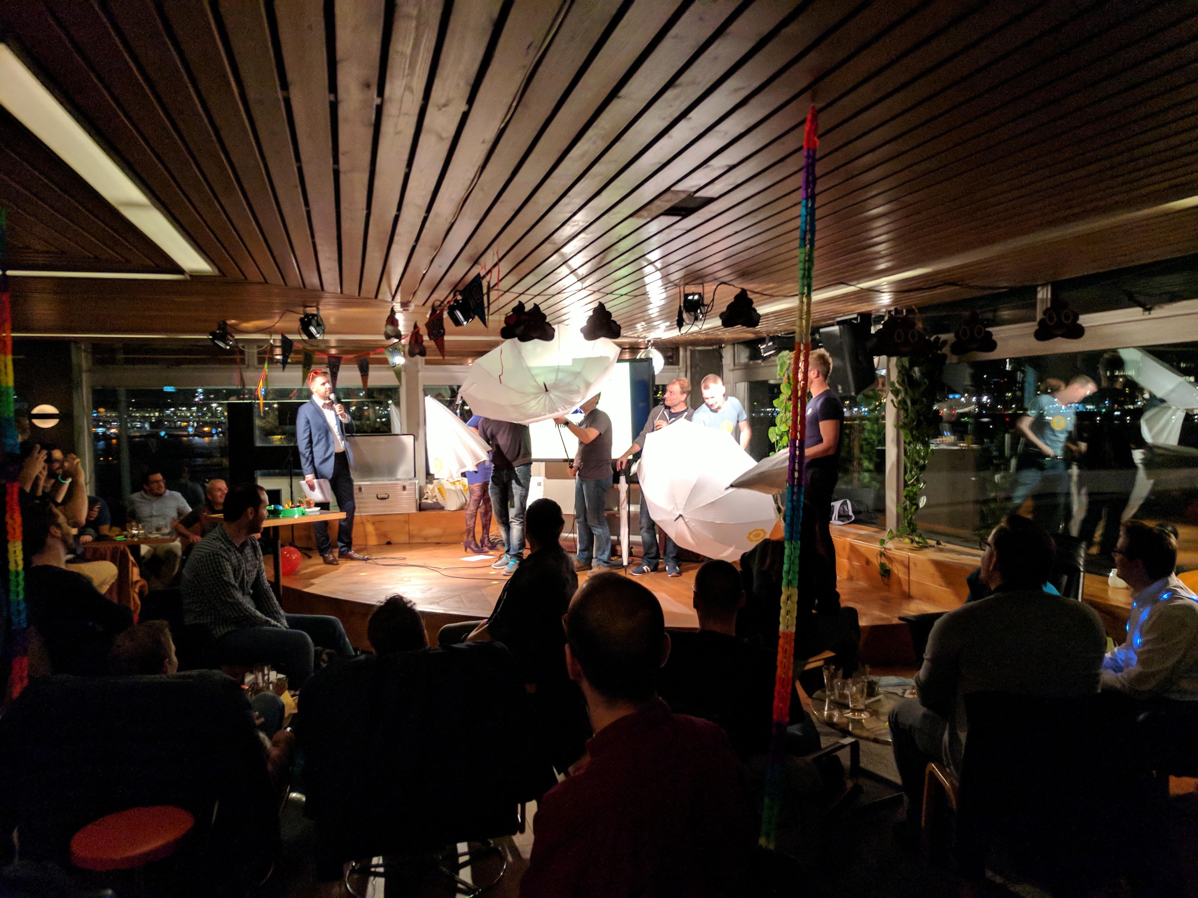
Afterwards we took the boat to Tolhuistuin across the water, where the FrontCheers pre-event party was taking shape. I figured I’d stay for one drink because I wanted to get back to my room to agonise over my talk, but after having a few beers and chatting to everyone I was among the last to leave. It was late enough the transport was sporadic, so we had to walk back to the hotel in the cold and the rain on the eve of the conference 😮
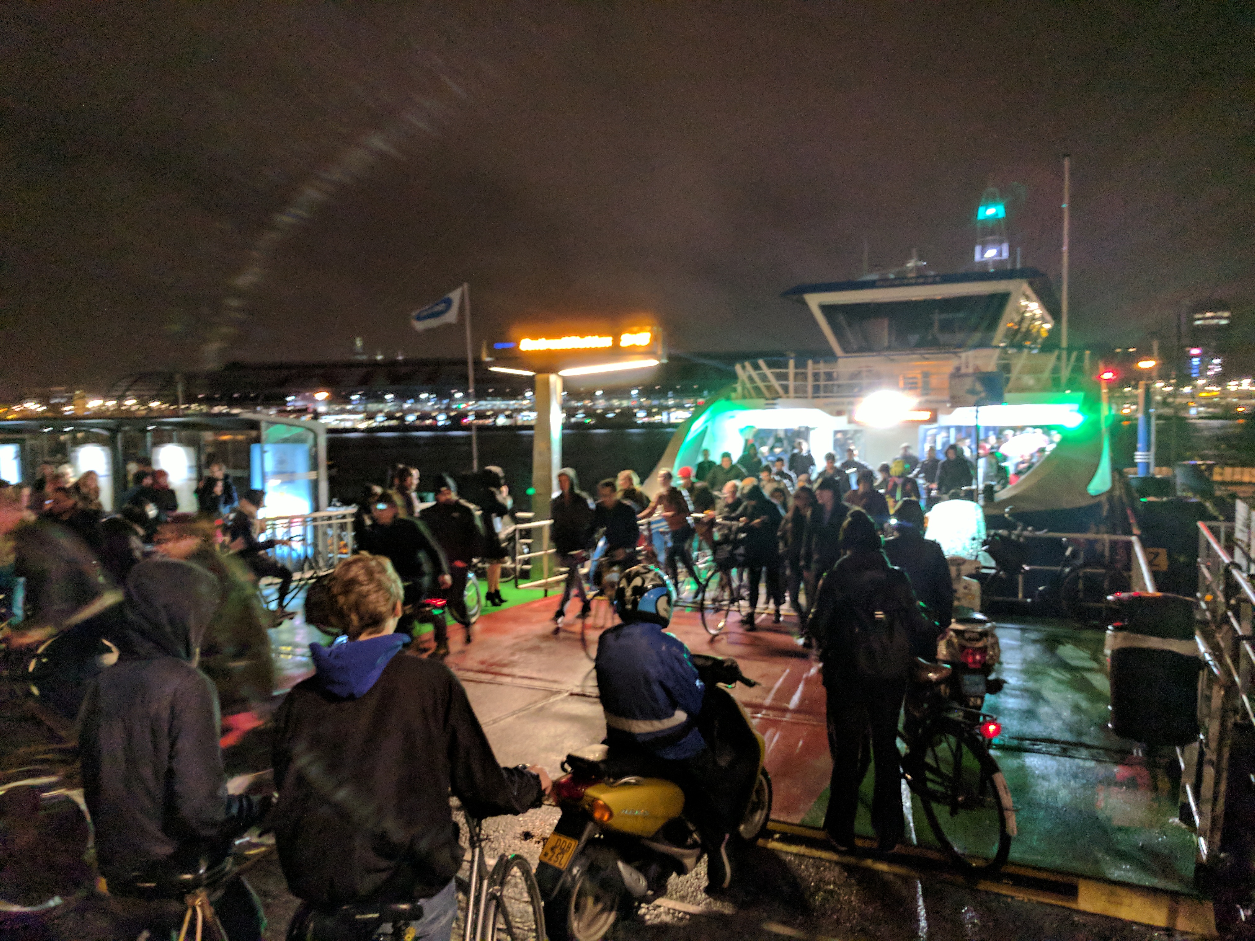
Fronteers 2017
October 9th, 2017 8:30pm

The conference itself was inspiring. The venue was breathtaking, and the production was flawless.
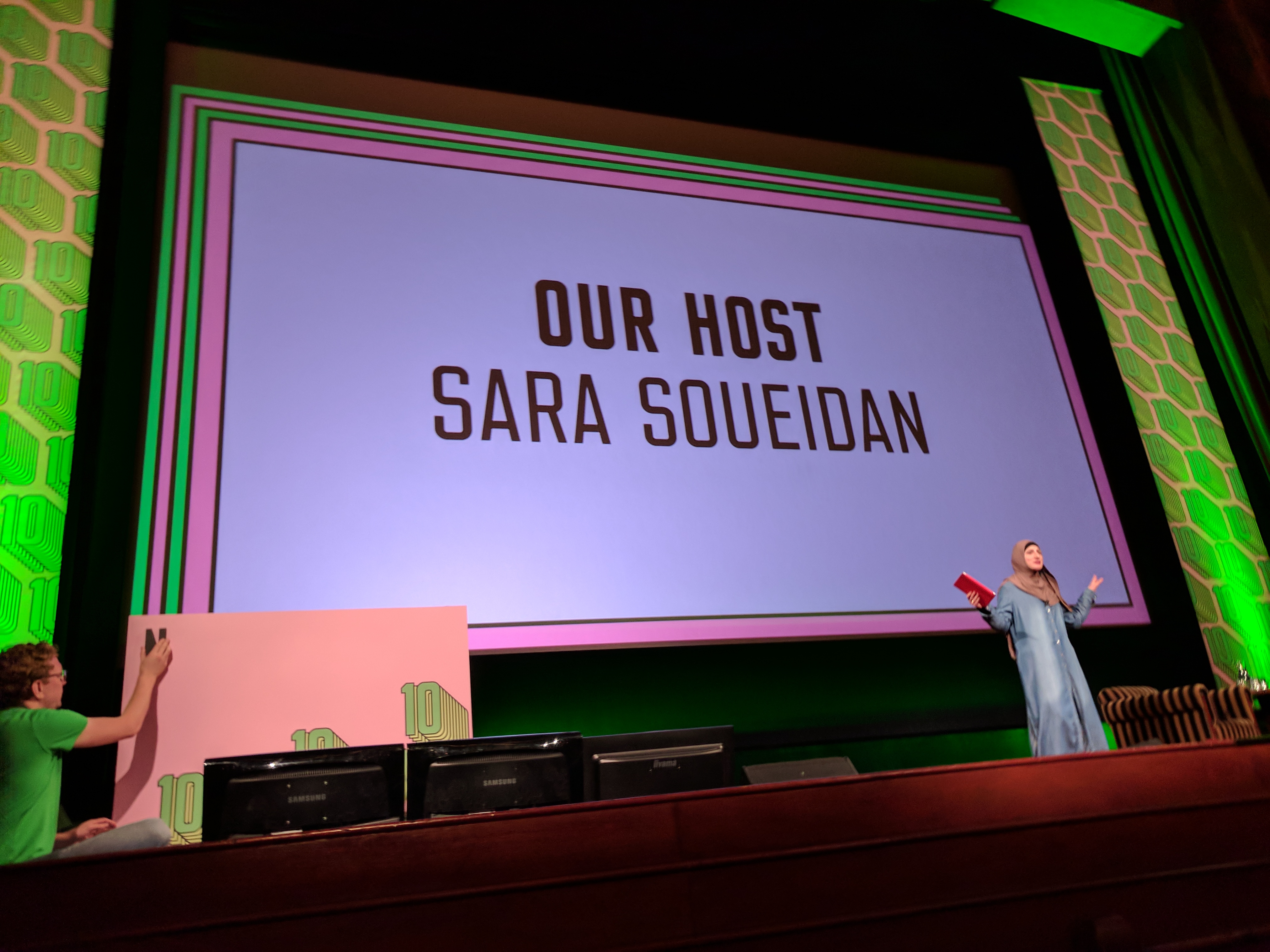
The first day was great. Sara Soueidan was a great MC and opened the day perfectly, leading into Niels’ opening presentation and fun history lesson.
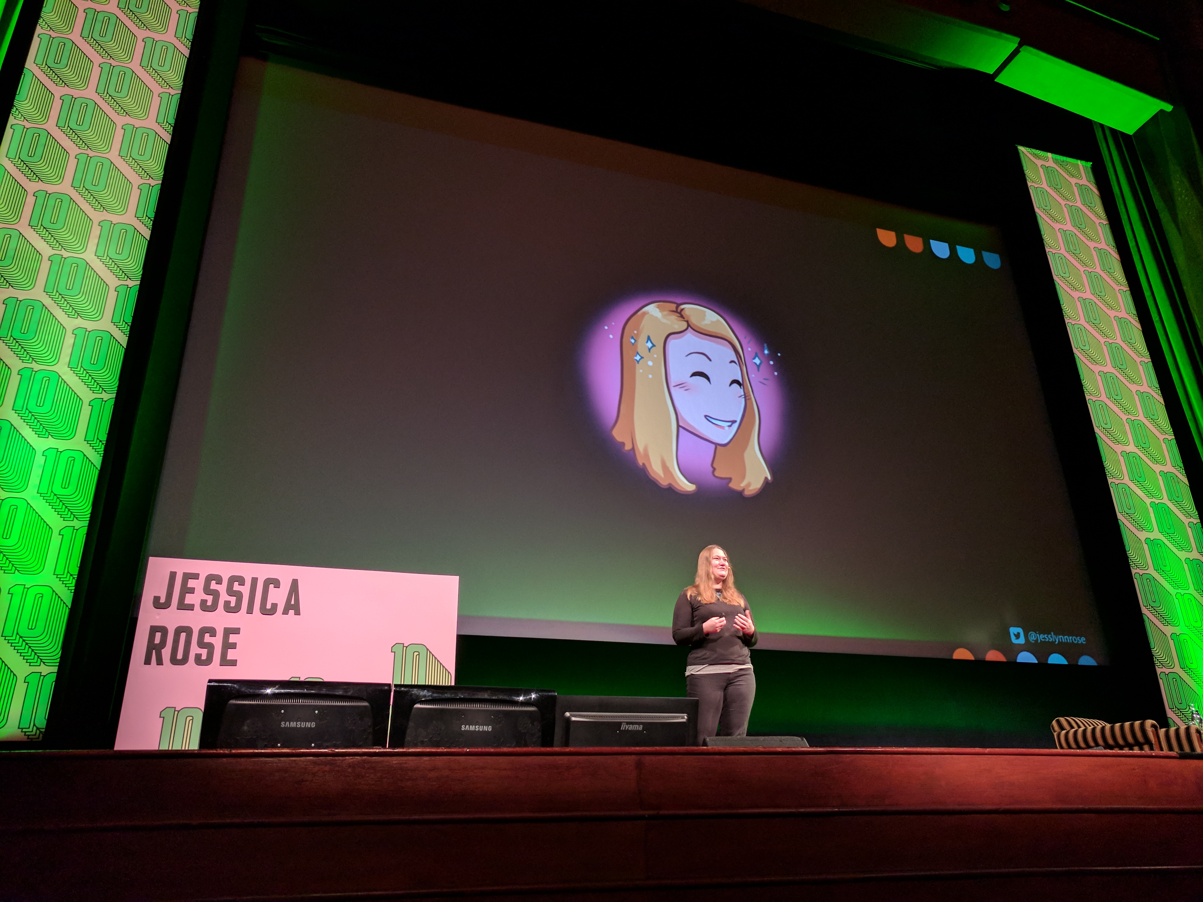
By far the most poignant talk of all was Jessica Rose’s talk on imposter syndrome. The entire trip I’d been wondering what the heck I’d gotten myself into, and was terrified that I’d arrivve and people would exclaim “oh, sorry, we were expecting the _other_ Ash Kyd who does cool stuff and is actually supposed to be here”. The talk sparked a lot of conversations and basically was a cathartic start to the festivities.
I really enjoyed all the talks, but I think my favourite tech talk of the day was Alice Boxhall’s “Debugging Accessibility” which ran through the stuff the Chrome team have been doing to improve accessibility. It introduced me to a lot of new concepts on the technical side which I’d love to play with more to produce tools to help improve accessibility testing.
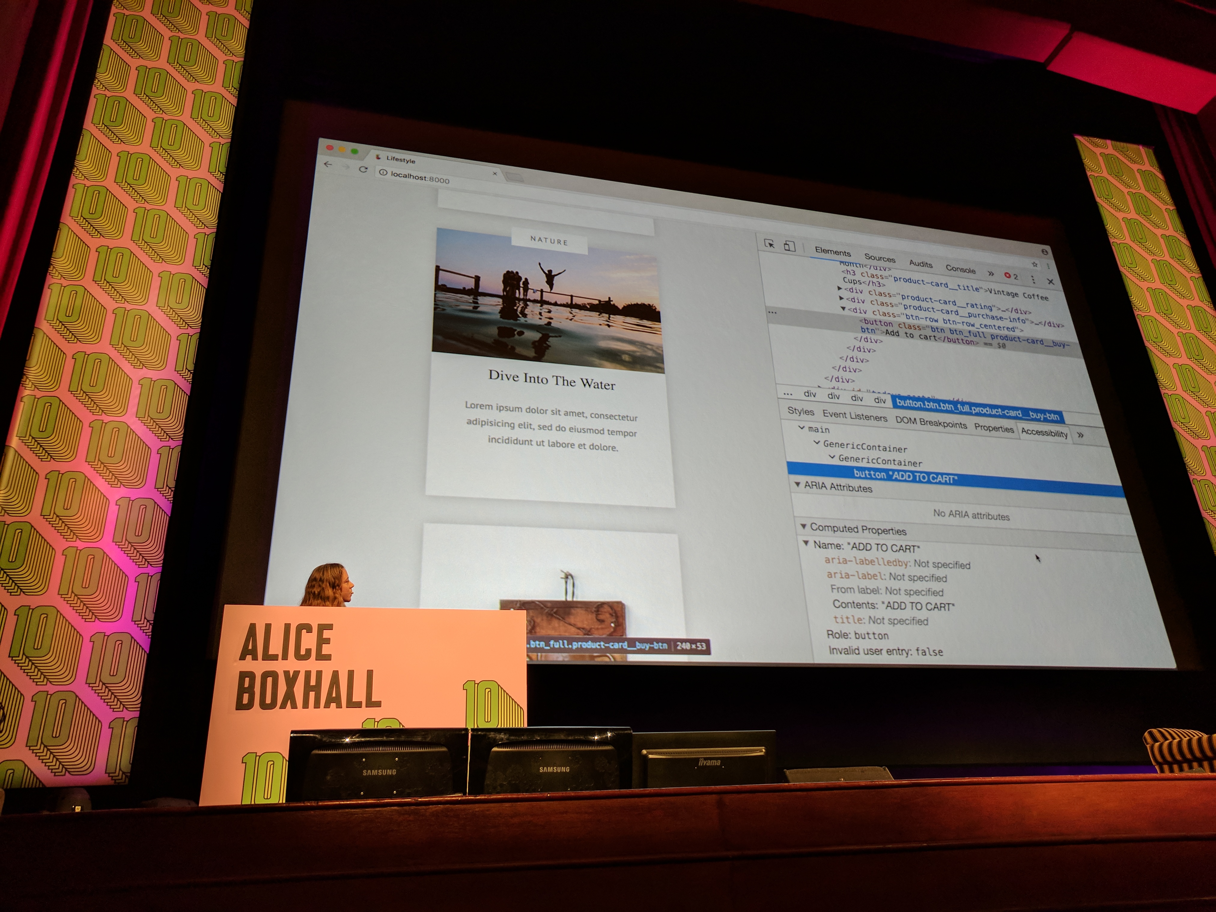
The talks were a lot softer than I was anticipating, which is a good thing for the audience as it leaves a lot of room for the imagination to do it’s thing. Though I was starting to worry mine was a bit much, and mightn’t hit the right targets.
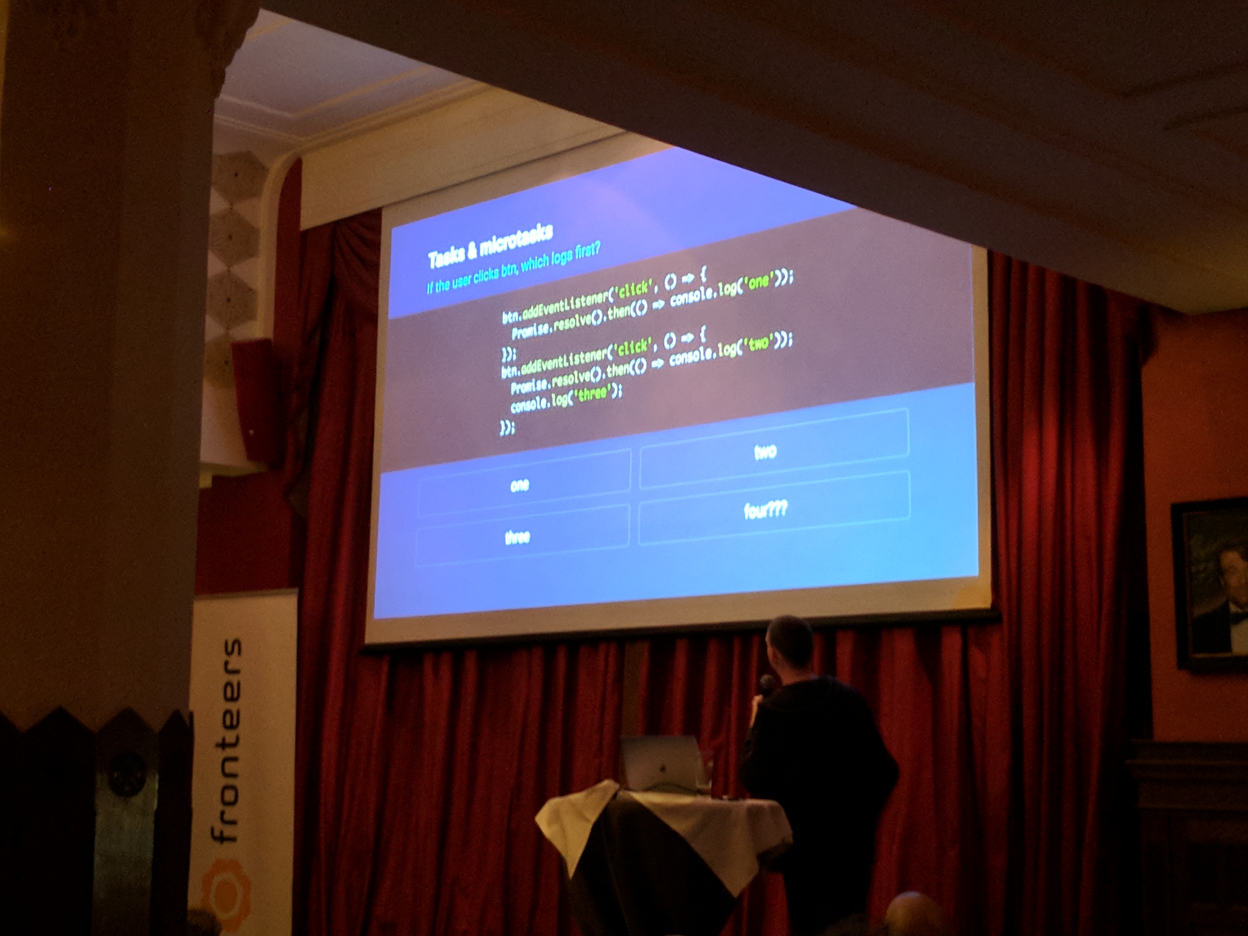
That evening we went to De Industrieele Groote Club for drinks and lightning talks. I was on edge beause this time I _really_ needed to go through my talk for the next day, and the talk titled “what not to do when presenting” was probably useful but very not helping my cortisol levels. So I left after the first few, though not before Jake Archibald thoroughly destroyed the audience with a mind twisting, but very highly produced pop quiz.
Back at my room I ran a bath, prepared my clicker, and ran through my slides on my phone until the fingers on my other hand were dangerously pruned.
My talk
October 10th, 2017 8:30pm
On the second day I woke up early after not enough sleep so that I could practice one final time. I was prepared, the talk was good to go, and honestly I was feeling pretty prepared.
I missed the first talk because I was late to the venue. This was fine, I listened through the doors as I faffed around my slides. After the first talk finished, I snuck in through the side door and took a seat. I don’t recall much of that morning, I was too involved in my own anxieties.
As the conference took a coffee break, myself and the other speaker Ruben set up our laptops, prepared the video output, and made sure we were ready to present.
As we left the stage and the crowd came back into the theater, I realised I had forgotten to pair my clicker, and had no idea if it would work when I went onstage. It’s a Bluetooth thing, and I’ve concluded that buying it was a mistake because it’s so opaque, I don’t even know how to turn it on without re-pairing it every time. So I frantically texted anyone if they had a presenter via our secret speaker back-channels, and Martin thankfully came to the rescue loaning me his.
The talk went… well. I was told that I looked collected, but I felt nothing like that. It’s an interesting feeling speaking in front of a large crowd, and to some extent I think my awareness of my situation disappeared when I went onstage, and aside some minor clicker issues I think things went smoothly. I eagerly await the video so I can dissect it, beat myself up, and ultimately improve for next time.
The rest of the day was a whirlwind of talks, indecision, “the best burgers in Amsterdam” feat. a waiter for whom it was their first day on the job, an after party, and an after-after party including karaoke (bad) and an Irish pub with the stragglers at 2 AM in the morning. It was a very good time, and I want to write up a proper Fronteers wrap on my proper blog over at my prroper site at some point.

Queer encounters
October 11th, 2017 8:30pm
On the Saturday I wasn’t sure what I was doing, so my new local friend Mystery T offered to let me stay with him for a night. At the same time one of his friends had been pushing him to go to a gay party night for the local rugby team, the Amsterdam Lowlanders.
T was reluctant but asked me if I wanted to go, I was reluctant but wanted to experience the night life, so we ended up agreeing we’d check it out and leave if it was too much. I dropped my bags at his and we sat around chatting for a while until it was time to tram back into the city.
A few days beforehand I walked down a street (Reguliersdwarsstraat) with a bunch of bars and rainbow flags hanging out windows, which I presumed to be a gay street. Turns out this was correct, so we walked to one of the bars to meet R (whose name I can’t remember but that it starts with R).
After getting to know each other and sharing stories (and talking about airline points, how has my whole life become talking about points) we left for the actual venue. After two trams and some walking, we were at our destination; a somewhat unassuming building with blacked out windows and a big “We <3 Rugby” football out the front.
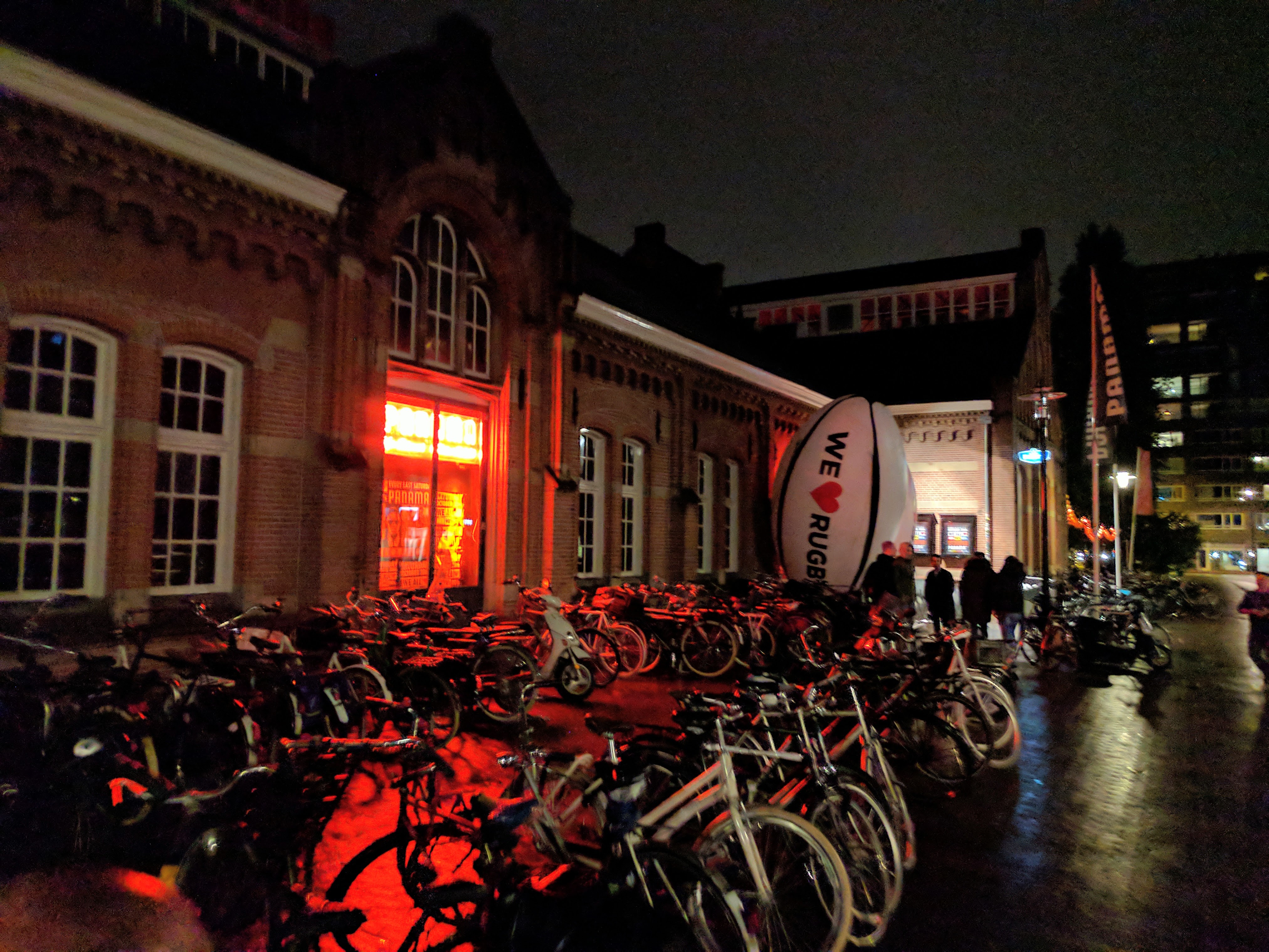
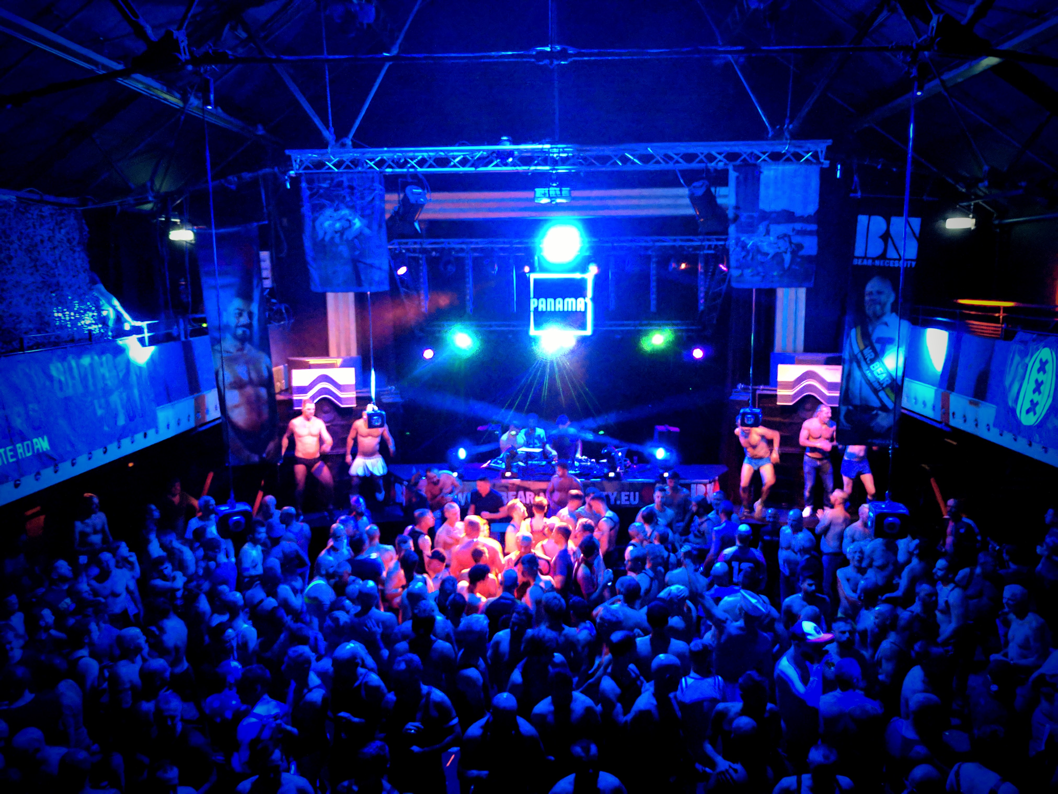
The party itself was amazing, it was full of bodies (mostly shirtless) dancing in an old industrial style thing. The music was nothing special, and the drinks were expensive, but everyone was having a great time and they gave out icy poles at one point which was cute and refreshing. I wasn’t feeling sugary,so I declined.
It started to wind down around 3:30 and got a bit depraved so we left soon after.
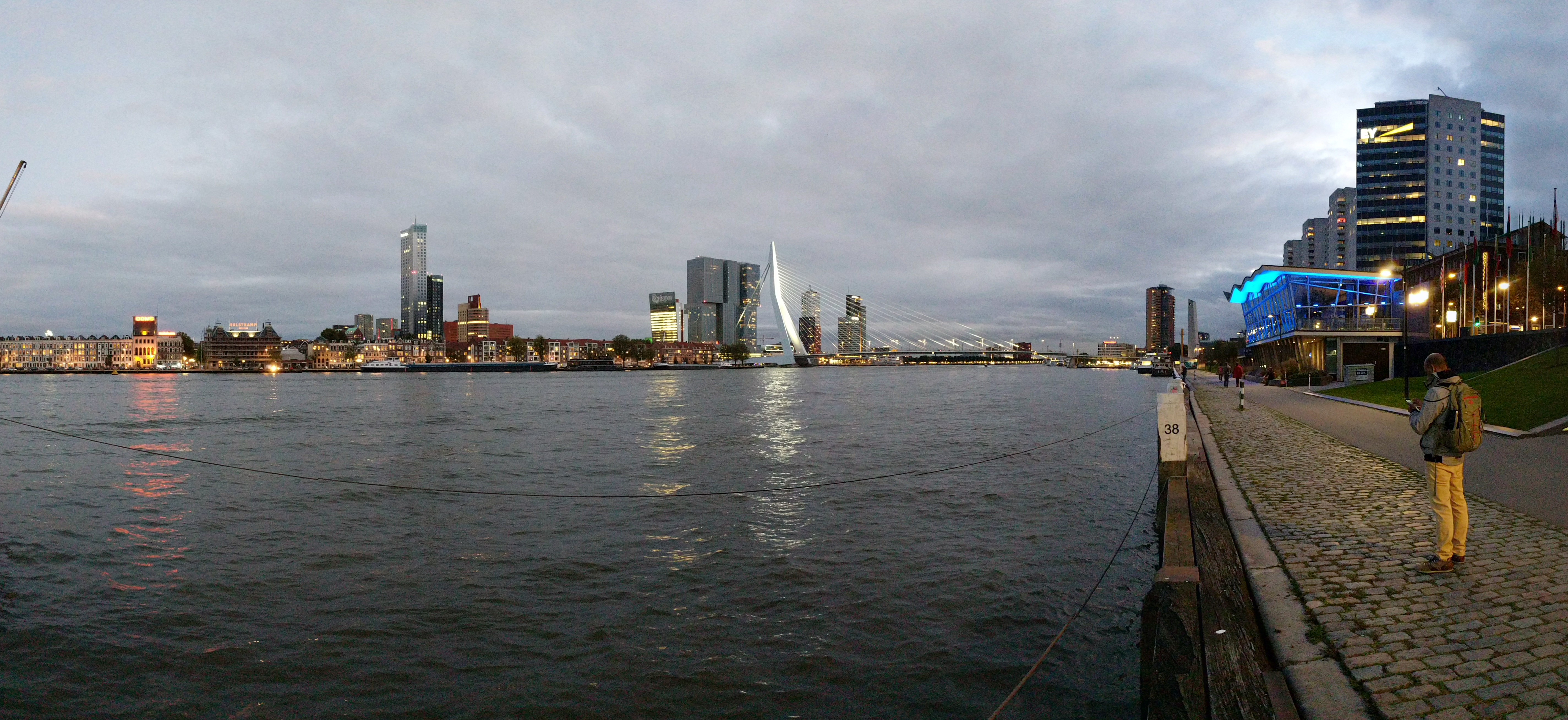
The next day I booked a little Airbnb in Rotterdam and we took the train down to explore the city. From Wikipedia:
The near-complete destruction of the city centre in the World War II Rotterdam Blitz has resulted in a varied architectural landscape, including sky-scrapers (an uncommon sight in other Dutch cities) designed by renowned architects.
It’s a really cool city, the center is modern and well laid out, whereas the surrounds are still traditional row type buildings.
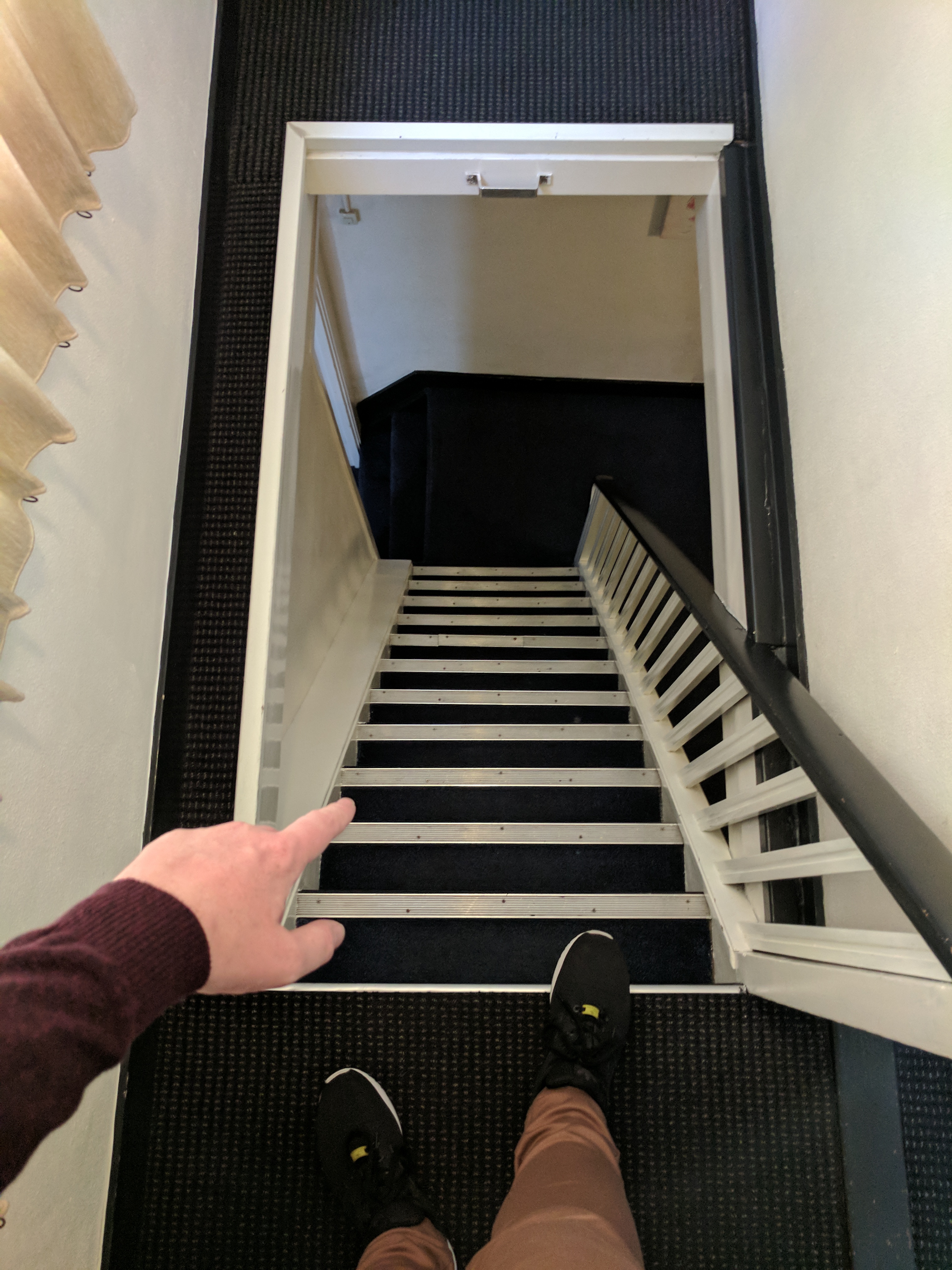
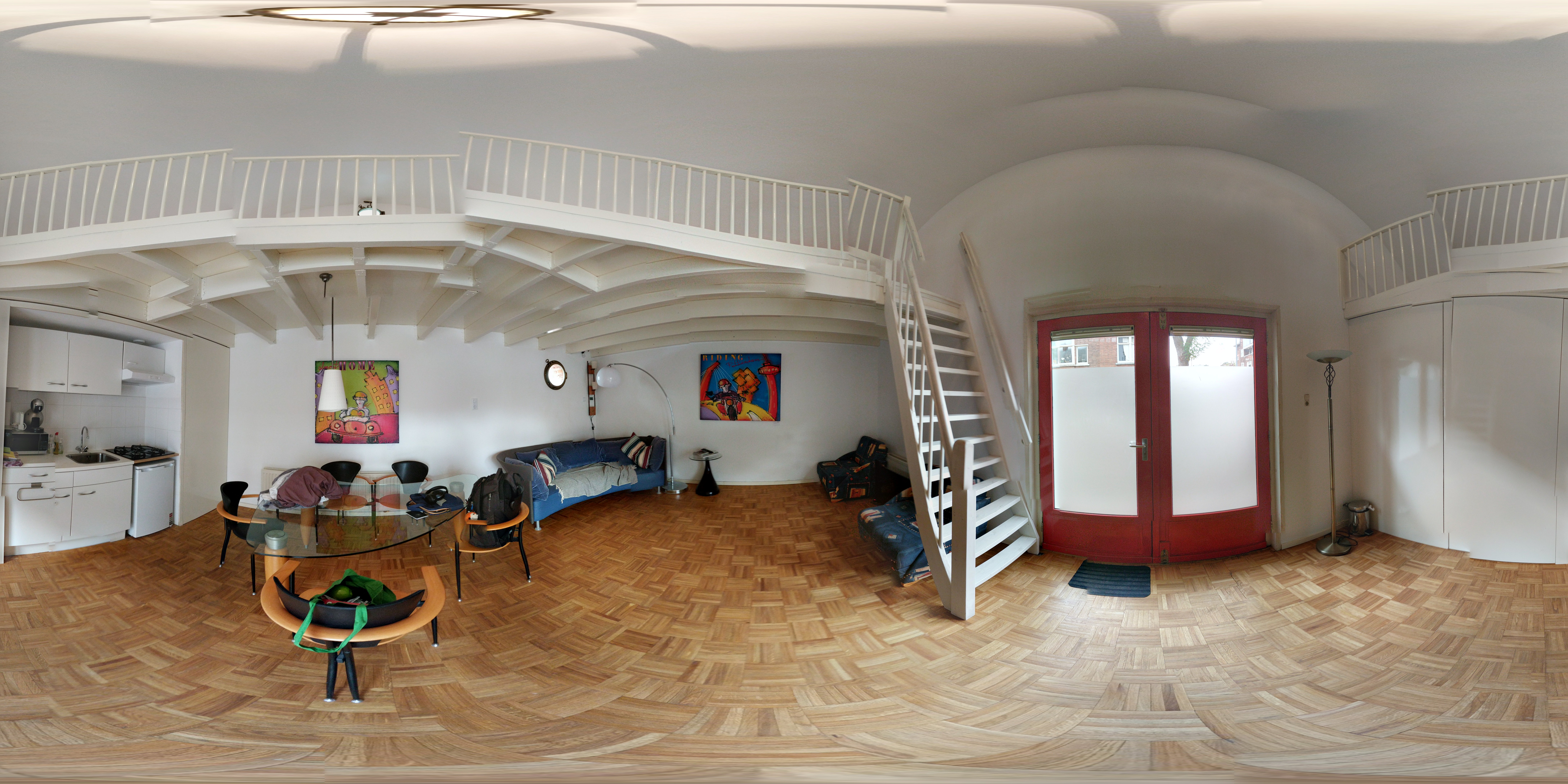
I stayed out in the suburbs in a strange, converted house under the hofbogen, which is an abandoned elevated rail line which has had buildings build up underneath. The Airbnb was a two floor affair with stairs steep enough I’d consider it a ladder, but it was very cute indeed. A bad photosphere follows:
I only stayed a night, leaving the next morning on a Eurostar to London!
The Motherland
October 12th, 2017 8:06pm
I arrived in London and things immediately felt different. Being back in an English speaking country was kind of a relief, but it also spoils the magic of a place to overhear people having the same mundane Bad Takes just with a different accent.
But still, what an interesting city!
I arrived in the evening and the very first thing I did was pop outside St Pancras to take a photo. Once that was out of the way I grabbed an Oyster card and made my way on the Underground to Soho to find my hostel.

After taking some time to recuperate and charge my devices it was time to head to Brixton to see Grizzly Bear play. A cursory glance at the map suggested it was walkable, but the sheer scale of London eluded me and it was actually much further than I expected.
Still, I walked past a handful of landmarks including Trafalgar Square, Scotland Yard, Big Ben (which I passed without noticing at all, oops). Once I got to Vauxhall I’d had enough and caught the tube the rest of the way.
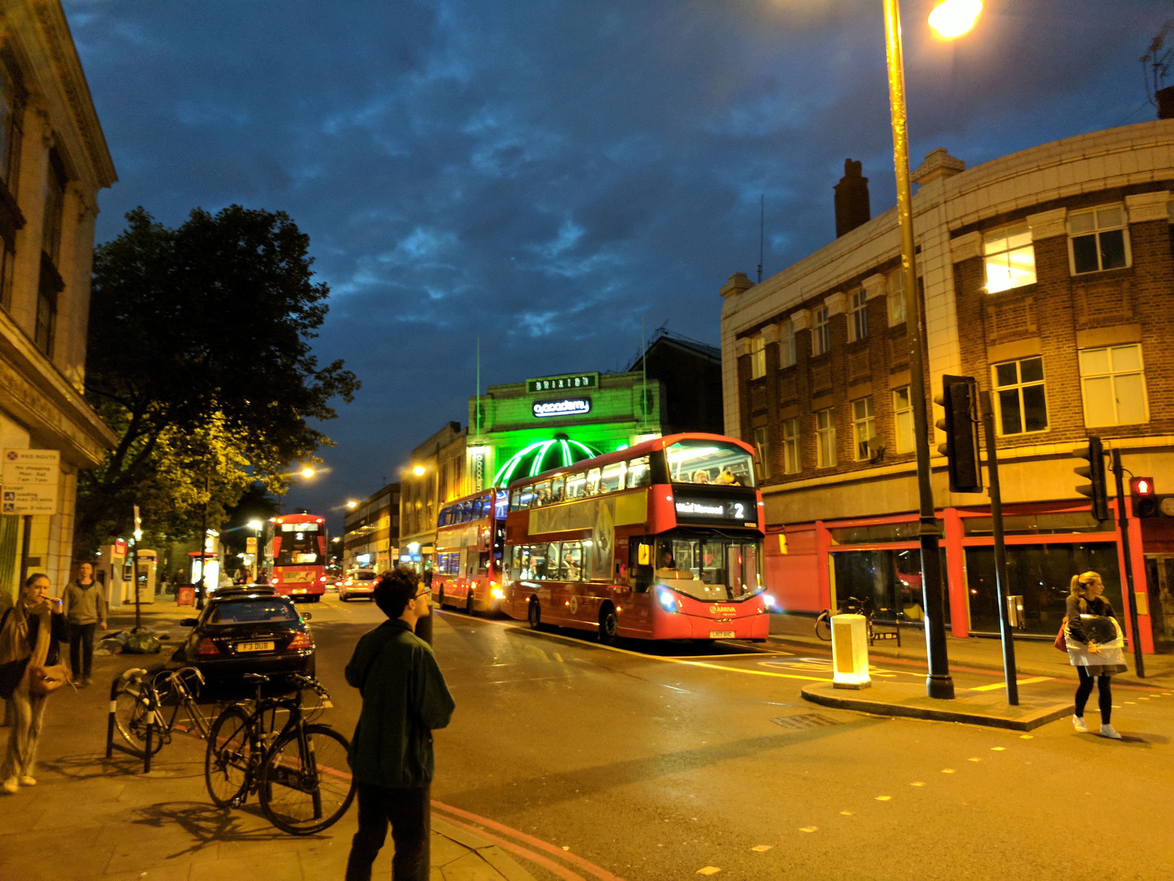
The calibre of the venue compared to anything in Brisbane was kinda eye opening and the event was amazing! I wasn’t especially taken with the autotune stylings of the warmup act, but Grizzly Bear themselves were stellar and well worth the trip. The venue was totally packed, the vocals were spot on, the band had some fun banter, and the bass was incredible!
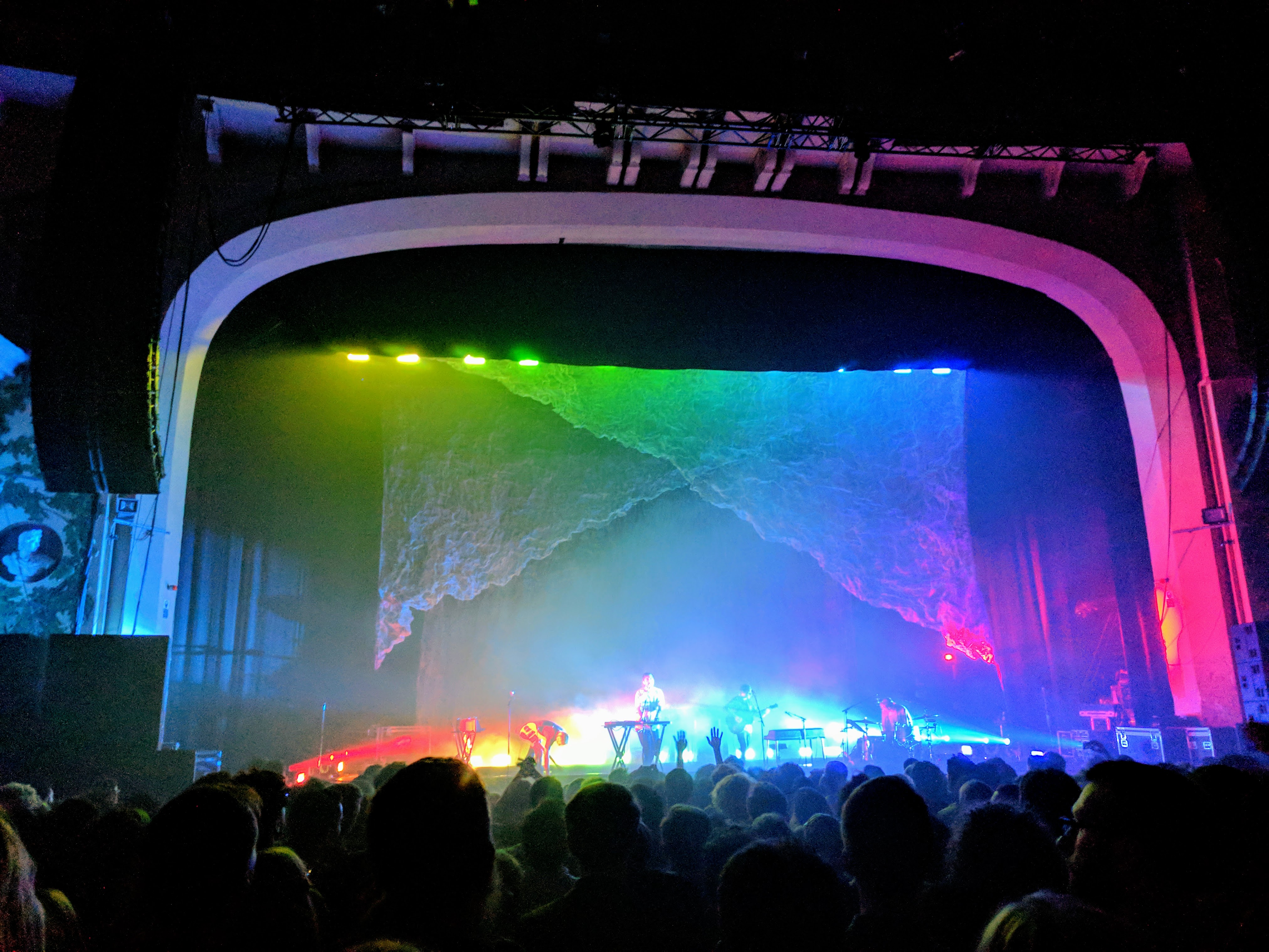
The crowd favourite was probably Two Weeks. Overall A+ event.
Not wanting to jump straight on the Underground, I went for a walk to Stockwell tube station and subsequently got lost on the metro. Apparently not all tube lines are equal, and while Google suggested I change from the northern line to the northern line at a particular station, I scoffed and ended up inexplicably at London Bridge.
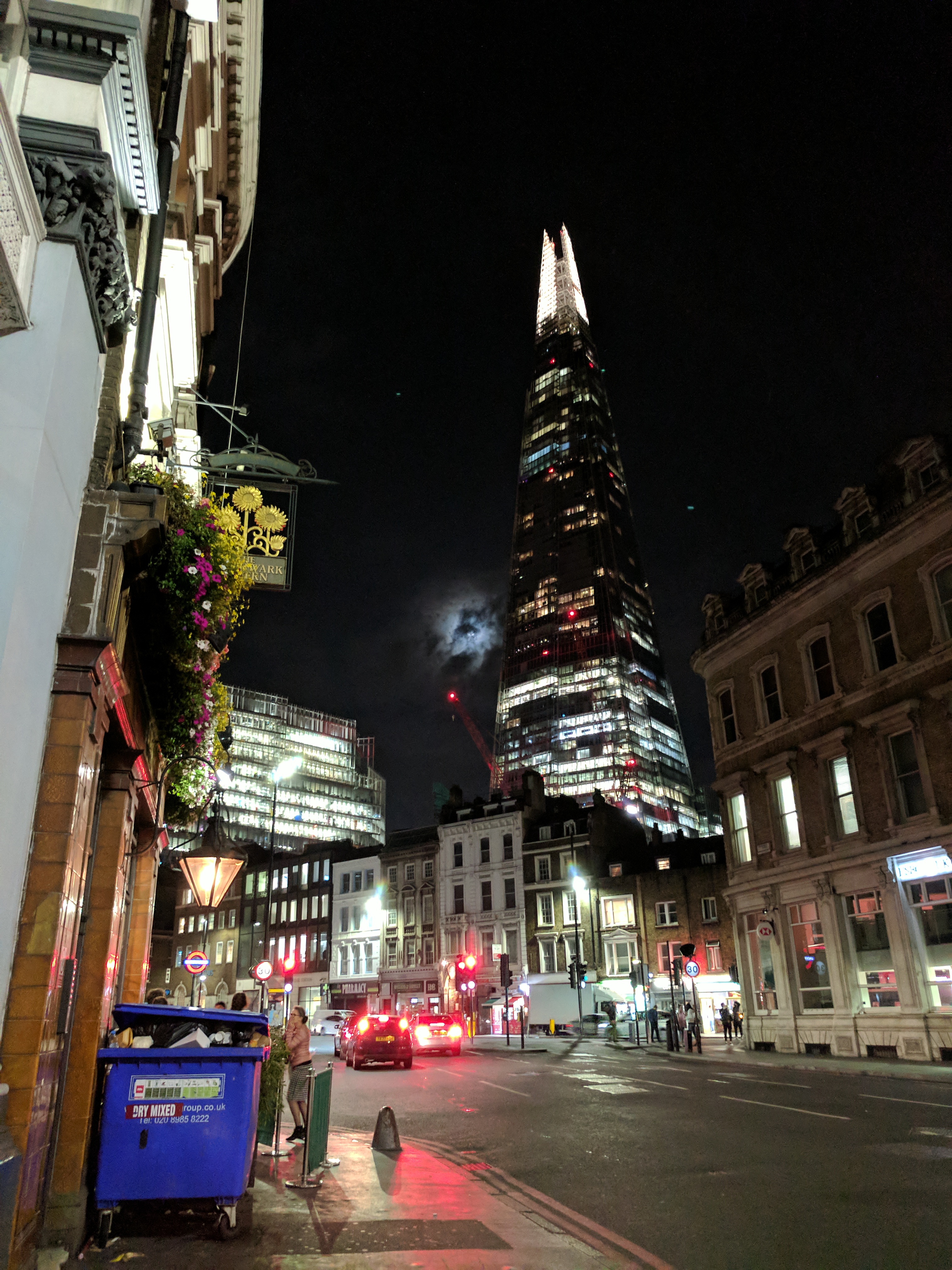
I feel I need to take a moment to express how shit London Bridge, the bridge actually is. It’s just a concrete thing with no defining features at all. I assumed it would be grand and British and some kind of landmark, but I would bet if it fell down tomorrow nobody would care at all.
I did have some good views of Tower Bridge as I walked across though, and that’s an impressive structure.
After getting some safe and sound I had a late start the next day. Instead of actually doing anything, I wanted to wander around and explore the place. Soho itself is super glitzy and honestly I didn’t care for it. So after stopping at McDonald’s for a bottle of water (Europe is dehydrating!) I trekked back out to St Pancras to do the only other thing I especially wanted to do in London: see the Black Books store.

They say you should never meet your heroes. Probably fair. Still, I have the selfie!
The rest of the day I walked around (about 10 km) exploring the place. I found a section of the Underground that was above ground which I thought was fun. There was a very handsome gentleman giving out Coke Zero out the front of King’s Cross station. But generally it was nice to admire the varying architectures around the place.
After a couple of hours it was time to meet Tom and Shashi for pizza and 2-for-1 cocktails at The Black Horse, SE8.
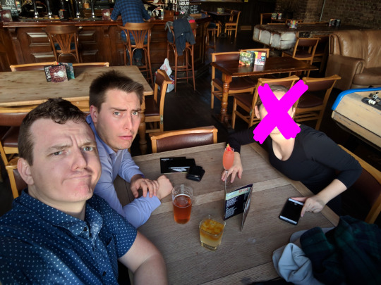
“Okay now pull a face” I said. Shashi pulled the very best face, but hated it so much afterwards that I had to censor it for the benefit of probably everyone.
Whirlwind tour of London
October 15th, 2017 1:55pm
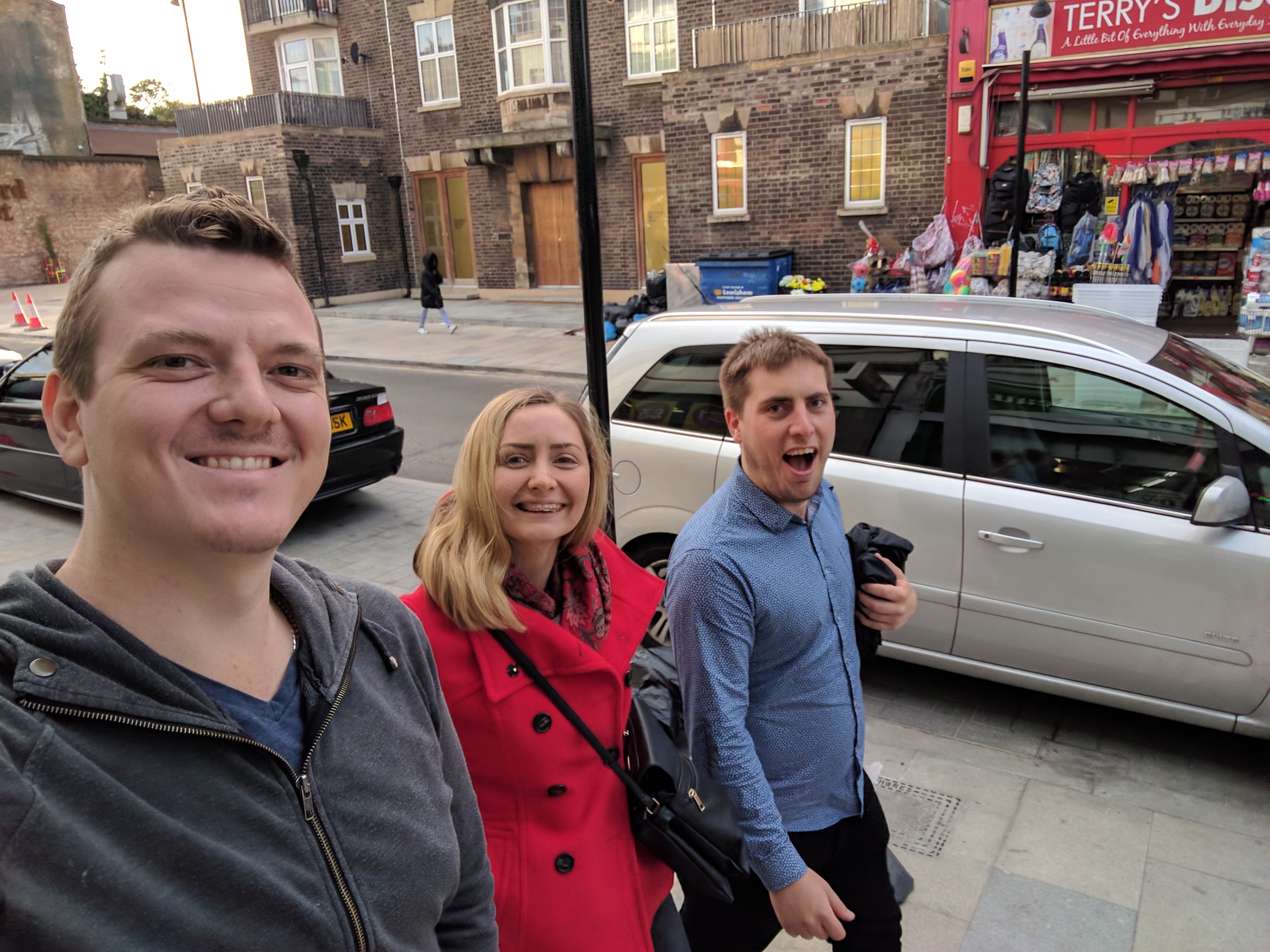
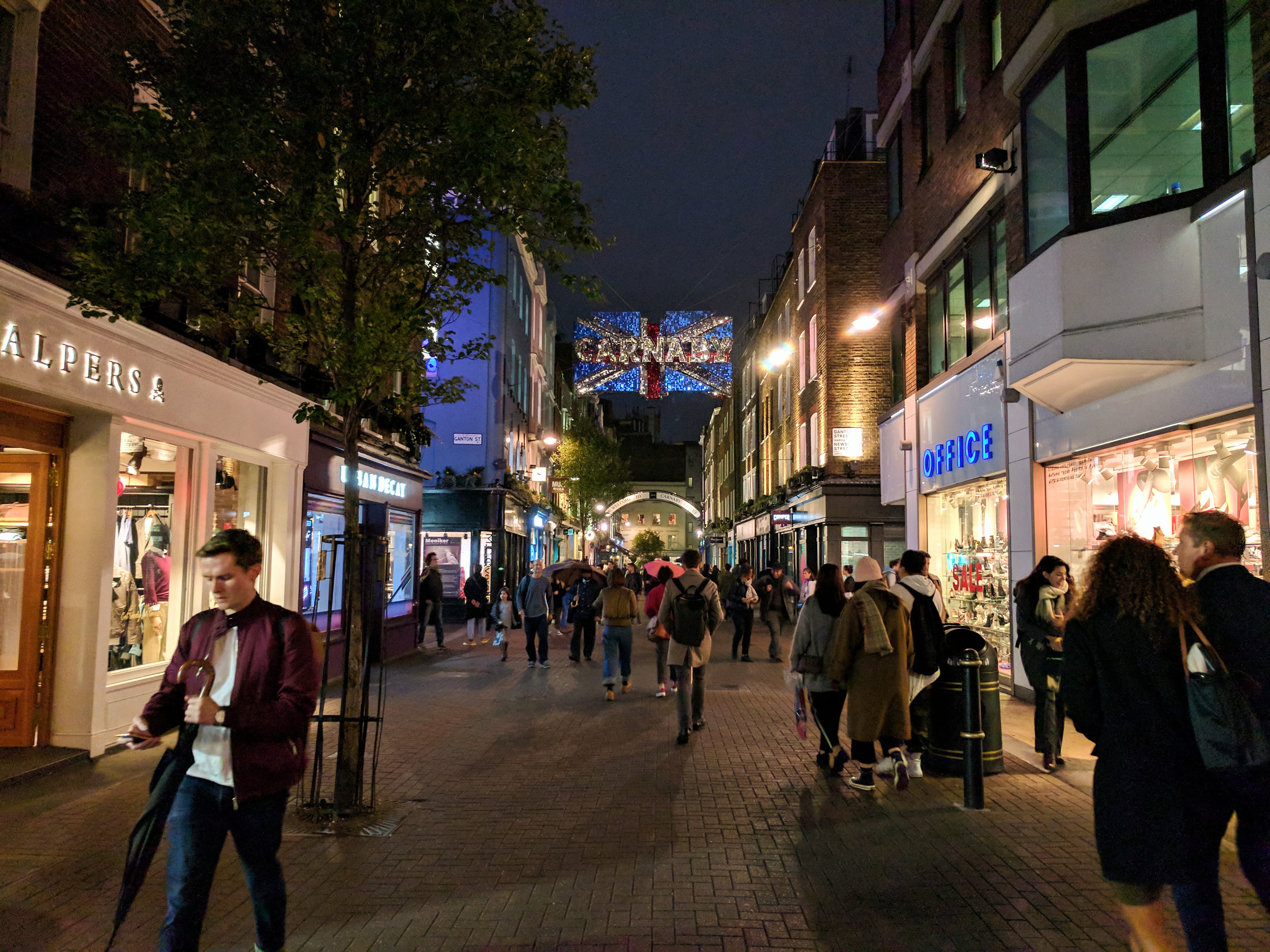
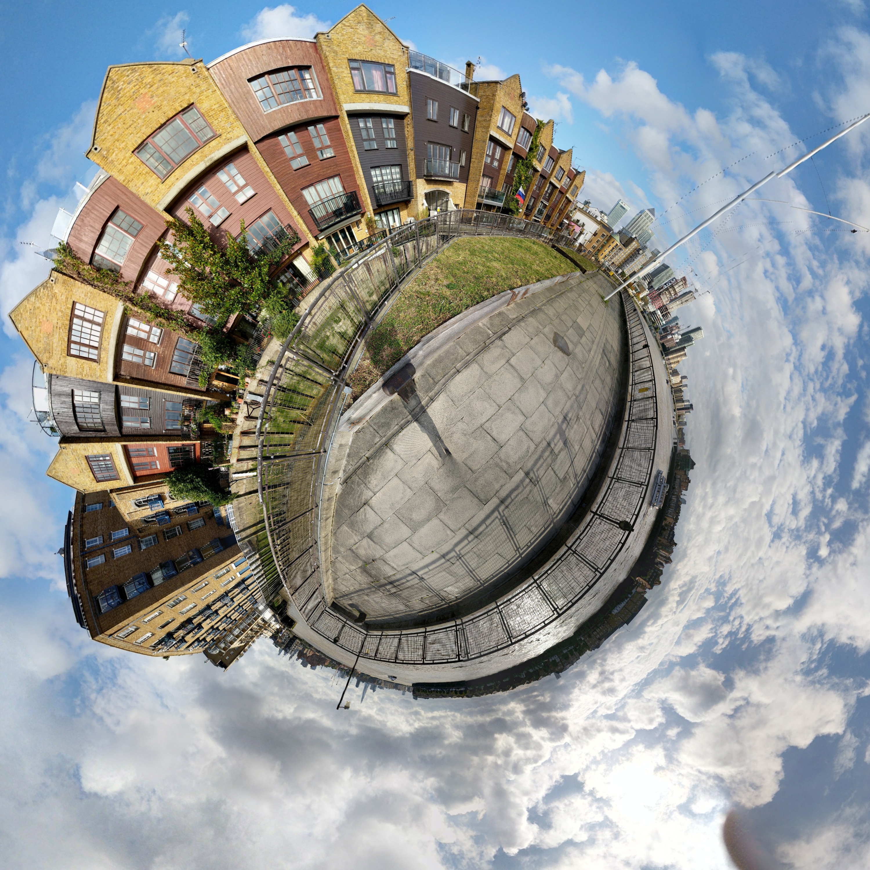

Third day in London I packed up my hostel and lugged my stuff to Tom and Shashi’s place. My original intention was to travel with carry-on luggage, but I had acquired stuff in my travels so I was working with three bags at the time.
One of the bags was full of stroopwafels and drop (dutch licorice) as a gift for Tom and Shashi, which I bought before finding out they both hate the stuff.
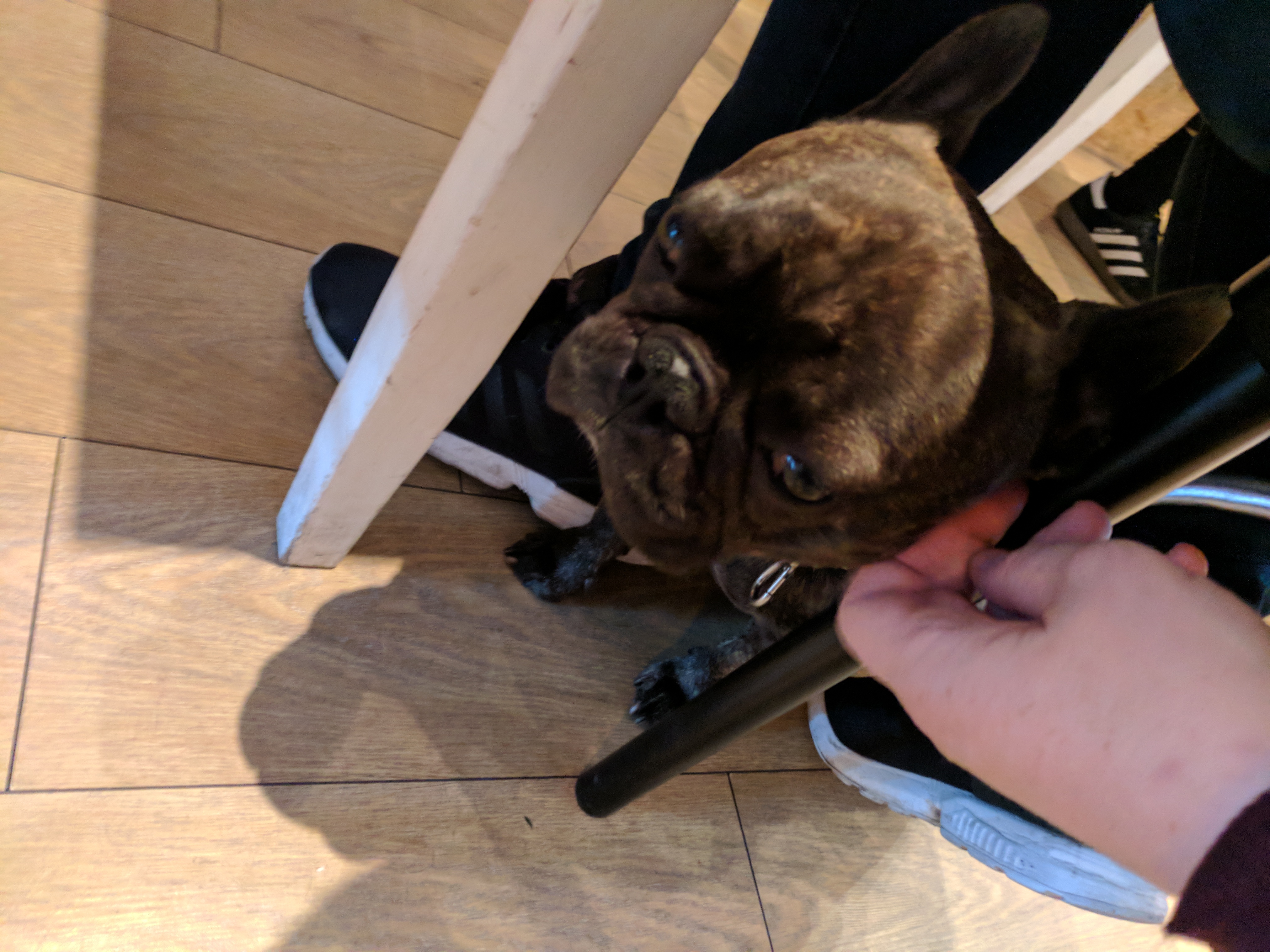
I mentioned I wanted some time out to catch up on Internet stuff so Tom suggested I have lunch at London Velo. I wasn’t expecting anything fancy, but it turned out to be a cafe/bike repair shop with a resident dog called Maurice who was super cuddly and plonked himself on my feet for scritches. What a cutie.
After doing some blog, checking some emails and all that I went for a walk to the DLR (Docklands Light Railway) to catch a train to Canary Wharf.

Every time I say the name Canary Wharf Tom screws his face up in disgust, saying “what do you want to go there for?” It’s pretty much a blando modern office precinct, but I wanted to see it because it was on the DLR line, and having grown bored of the touristy areas I kinda wanted to walk around.
I didn’t spend long there, but I had a look around and marvelled at the glass monoliths blocking the sky.
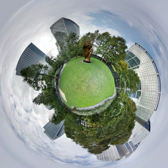
After that I started walking along the Thames path, finding misleading signs and locked gates galore. I read The Guardian’s take on Privatised London: the Thames Path which is a fascinating tale of people and developers being bad dudes.
From the Isle of Dogs to Tower Bridge, just how much of London’s riverside walking route is actually open to the general public? This specially assembled Guardian exploration party would stop at nothing to find out
I walked as far as Wapping before Tom and Shashi finished work and summoned me to dinner at the upscale food market Mercato Metropolitano.

Afterwards we toured a bunch of miscellaneous London landmarks.

The next day I was feeling a bit out of sorts so spent a fair portion of it inside. We did go for drinks and dinner, where there were several more dogs to play with.
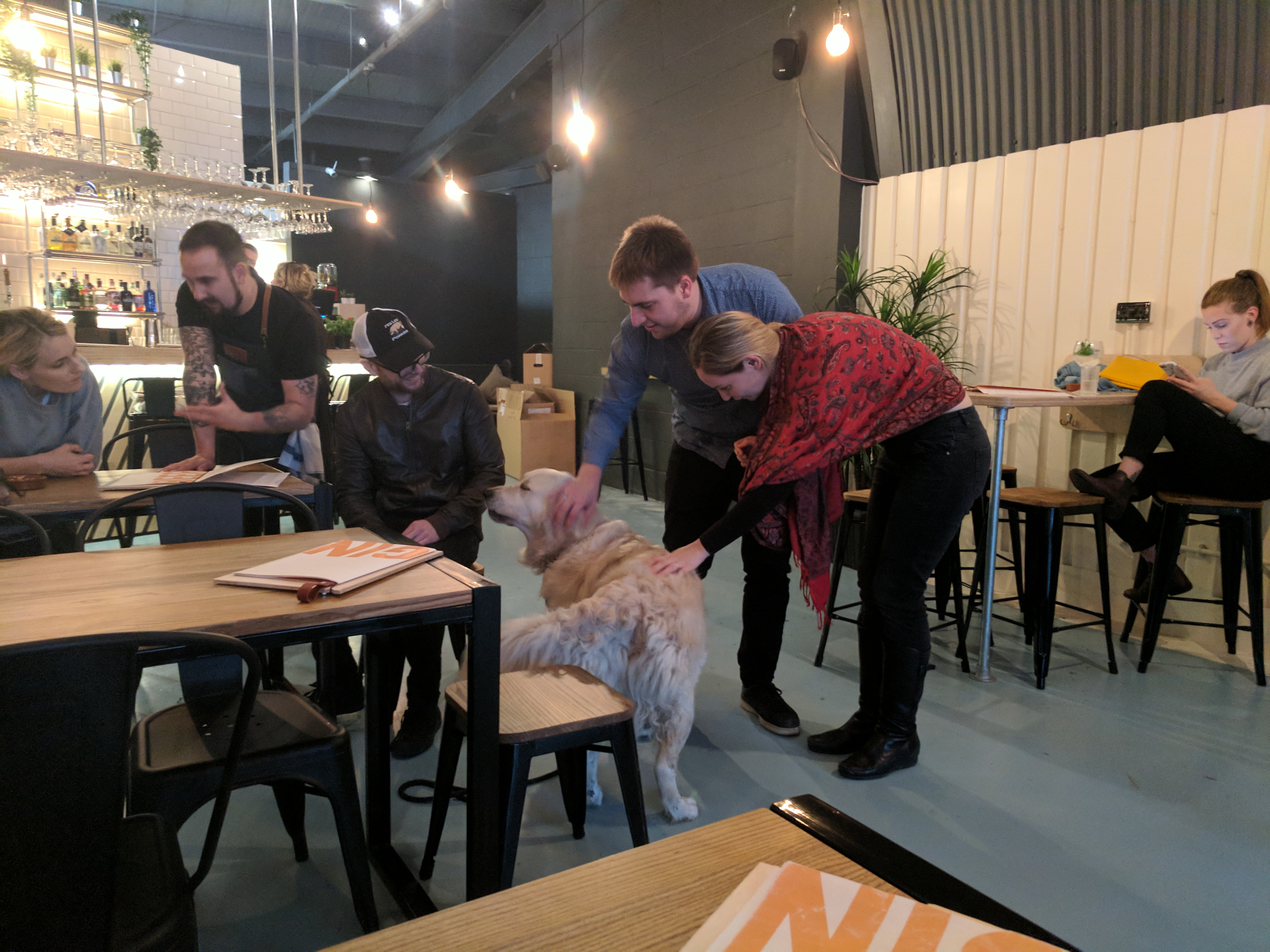
London is a very Dogs place.
Toronto
October 16th, 2017 11:00pm
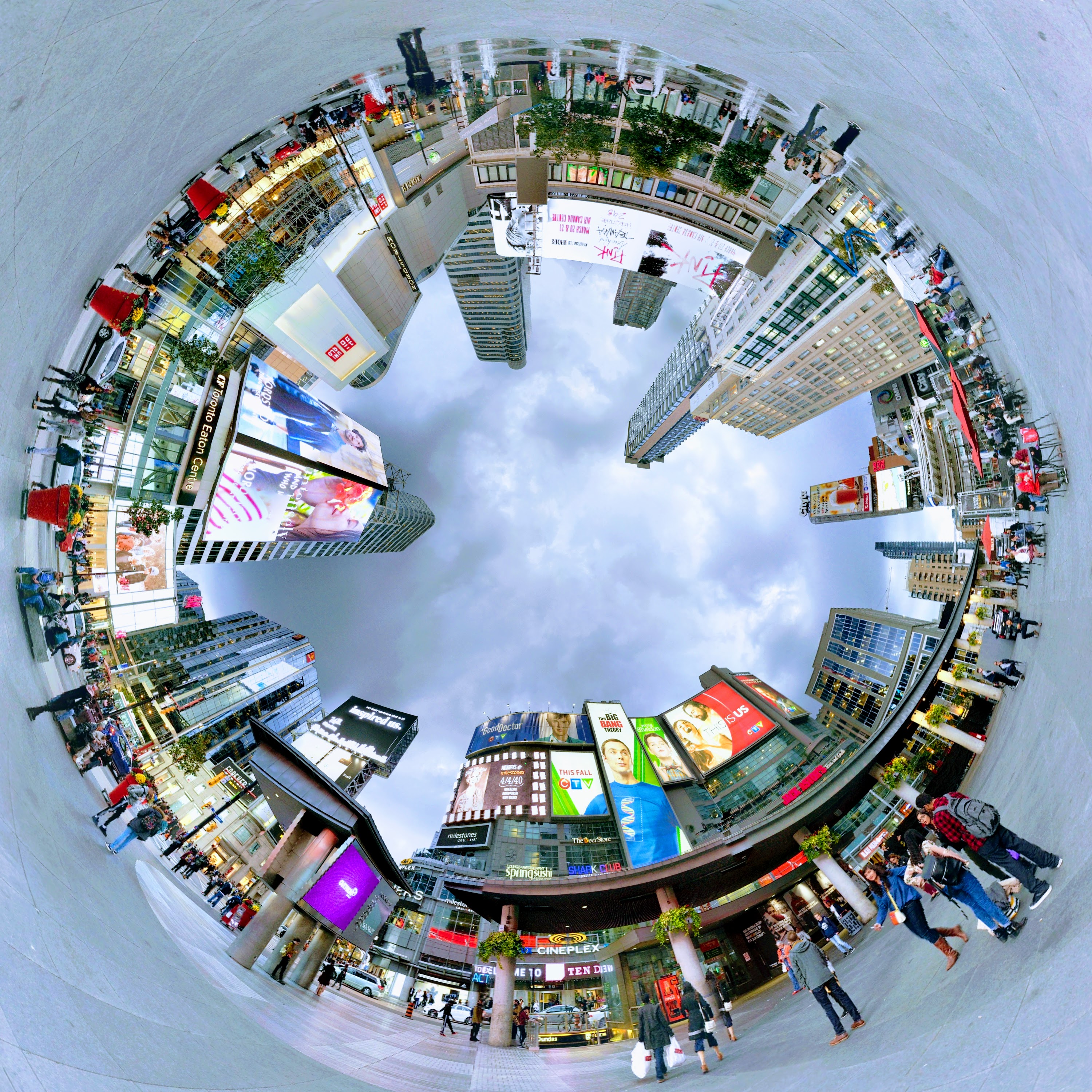
On the Friday I caught the train to Gatwick airport, and flew to Toronto.
Pearson International in Toronto had a weird inter-terminal shuttle train with rubber tyres driven by some sort of cable system. This took me to the train station where I caught a diesel train to Union Station. None of the tracks are electrified, so all the trains run on diesel in 2017; mind blown.
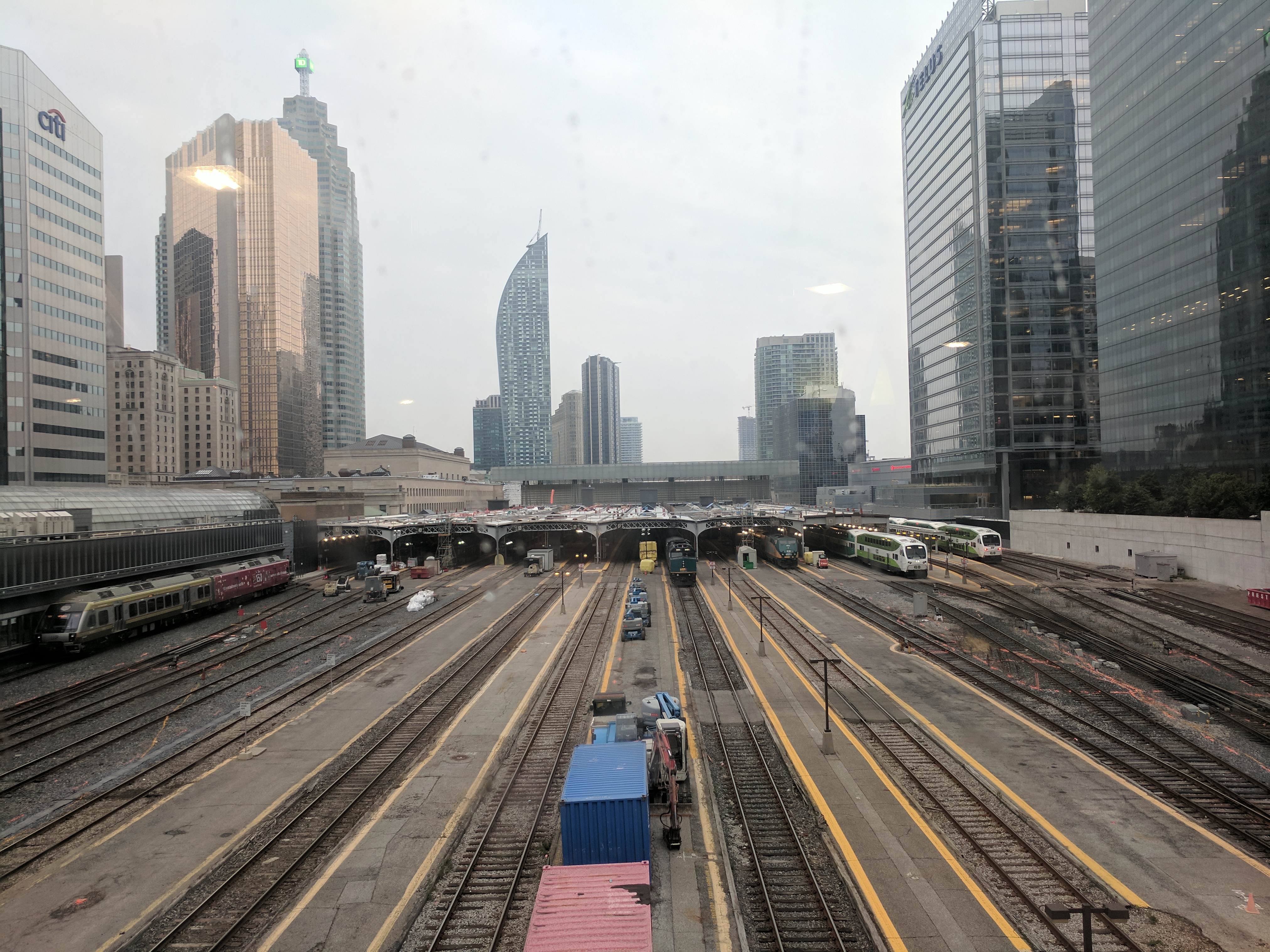
From there I tried to catch what I thought was a bus to my Airbnb, but actually turned out to be a subway train.
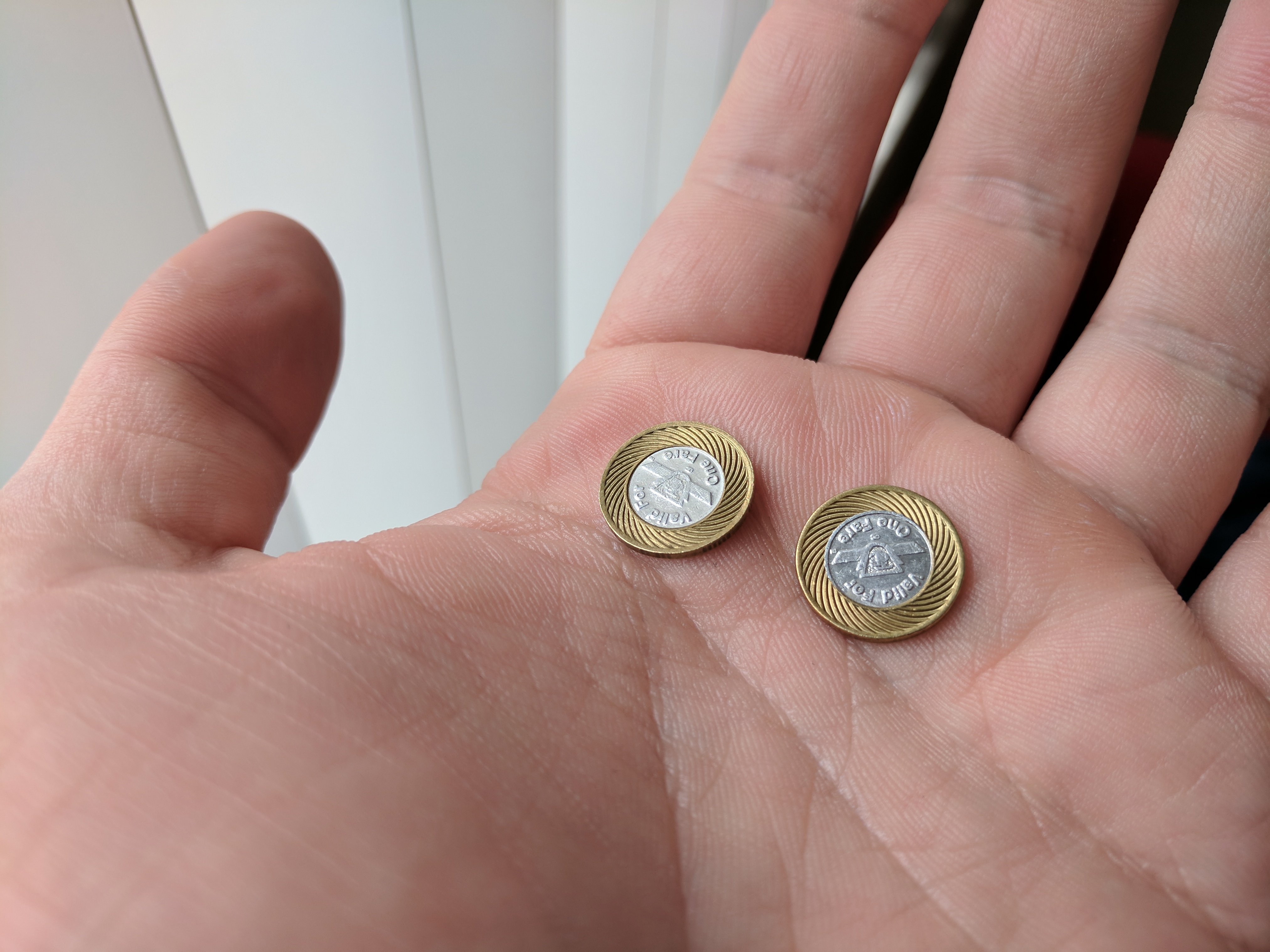
It was a bit of an ordeal because I couldn’t buy a ticket with my card so had to find an ATM to withdraw cash, then buy Pringles to break the note in order to put it in the machine to get subway tokens to use the subway.
Yeah, the subway uses tokens in 2017; mind blown.
My accommodation turned out to be right at the edge of all the action, overlooking Ryerson University, and three buildings across from where Dayle and Adrian used to live.
Sez Dayle:
Holy shit! That’s our old hood!
We lived at <redacted> gerrard for years!
And i went to Ryerson for years too!!
Small world, right?
As I hadn’t bought a North American power adapter with me, I walked to Best Buy and bought one. Best Buy is pretty great; I talked to the dude in the Google display about the new stuff, and I’m thinking of getting a Daydream before I go back to Australia because they’re $40 cheaper than back home.

With my electronics sorted, I faffed around town for a bit (and accidentally bought a smoothie bigger than my head) before retiring for an early jetlag bedtime of 10:00 (3 AM London time).
Day 2 in Toronto I was starting to feel pretty nasty and coldy, so I lazed around in bed for a few hours before getting up and facing the day.
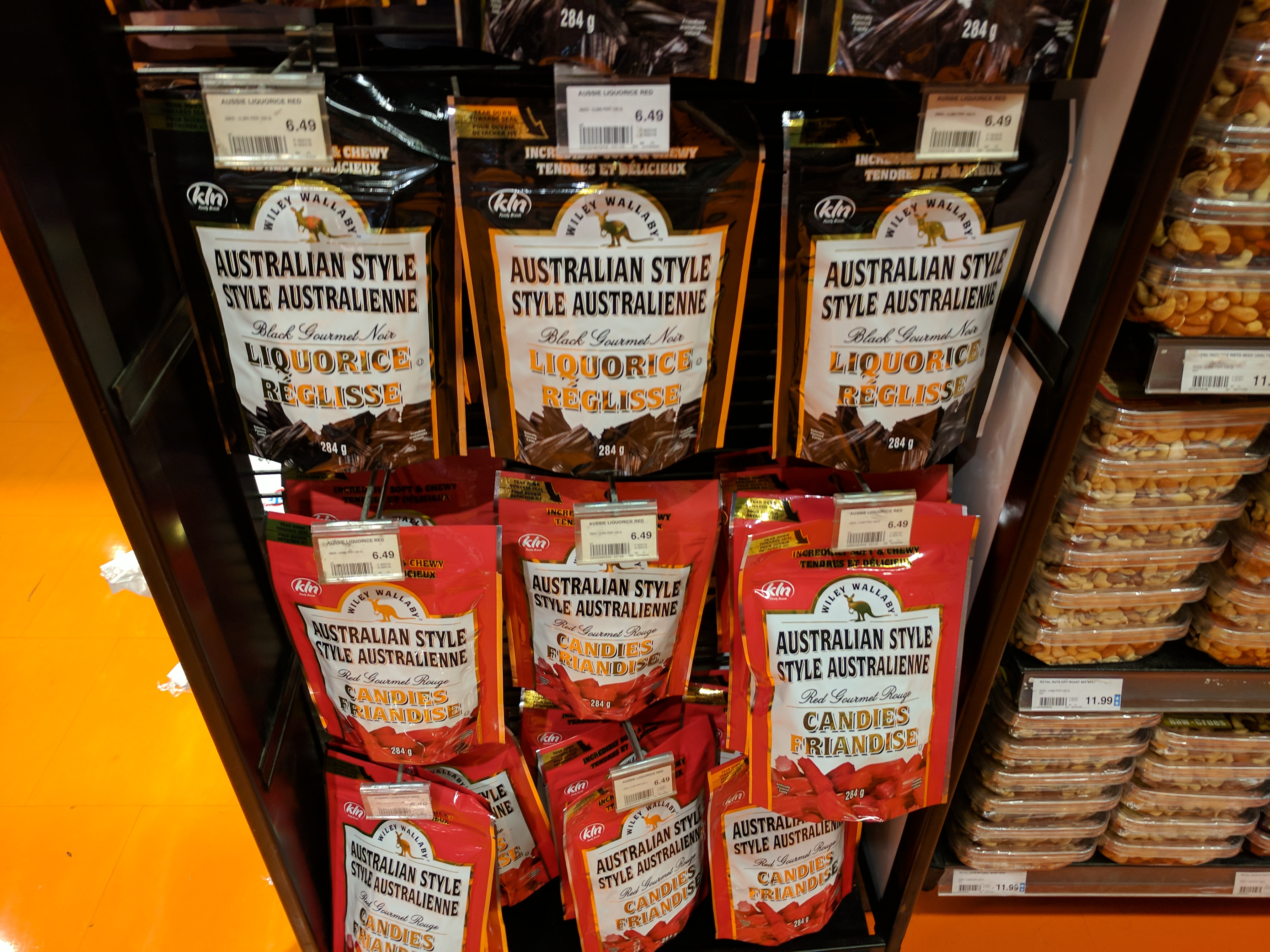
There were a few landmarks I wanted to check out. One of them was the Loblaws that was just around the corner which Dayle said used to be a historical hockey arena before it was converted into a supermarket. It was massive and beautiful and they had Australian style licorice which I was tempted to get for the kitsch factor, but the CAD 6.50 price tag was sobering and I quickly calmed myself.
The next stop was Kensington Market which was a chaotic bohemian neighbourhood with lots of little shops and food stalls. There were bikes everywhere, people with bags and dogs all over the place!
The thing that caught my eye most was the stand selling empanadas. Having seen Empanada Dog and not really knowing what an empanada is, I really wanted to try one for myself.
However the little shop didn’t have a card reader, and after Pringles and the subway I only had a few dollars worth of coins. Also I have only vague notions of how tipping works so I panicked and walked on by without buying anything.
No regrets.
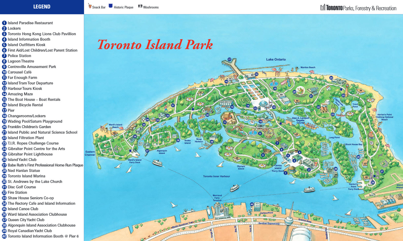
The third stop of the day was Toronto Island Park. The ferry deposited me at Centre Island, and my destination was the bike rental on the far side, so I set out at a medium pace.
Unfortunately, when I got to the bike rental it was closed, along with much of the island because apparently everything shuts down for winter and hasn’t opened back up again yet.
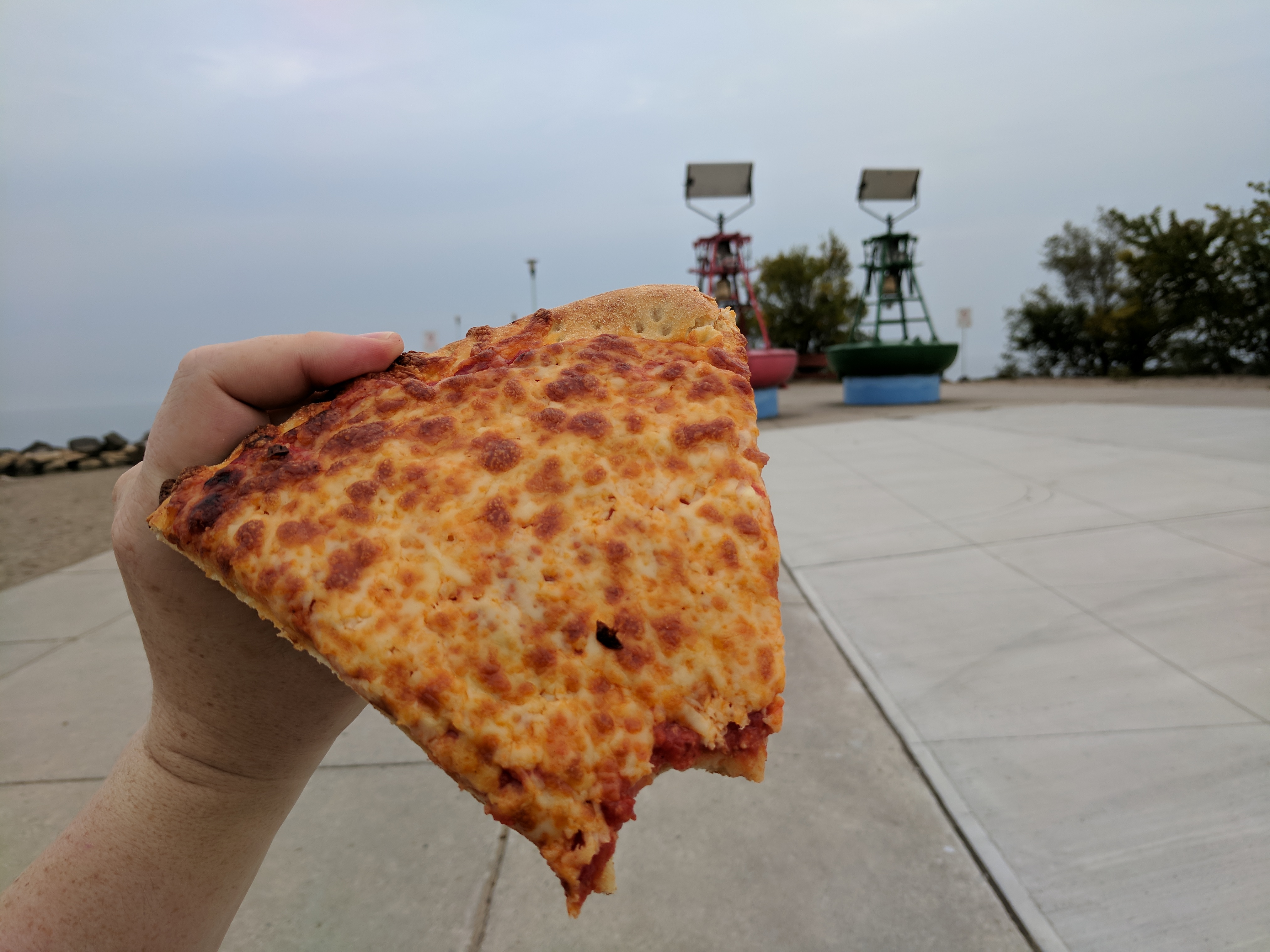
There was a pizza place closing up when I got there, so I got an old slice of cheese (the couple in front took the last two pepperonis, damn them), and walked onto the pier to contemplate my lack of cured meats.
Toronto Island Park reminded me a lot of Rollercoaster Tycoon, everything was very quaint with amenities scattered around the place, and various bits of landscaping at intervals. However I really wanted to drop a handyman to mow the lawns and maybe toggle all the shops to “open”.

With nothing really to do, I ended up walking 40 minutes to the far side of the island so I could catch a glimpse of the planes landing at Toronto Airport, where I caught a ferry back to the shore.
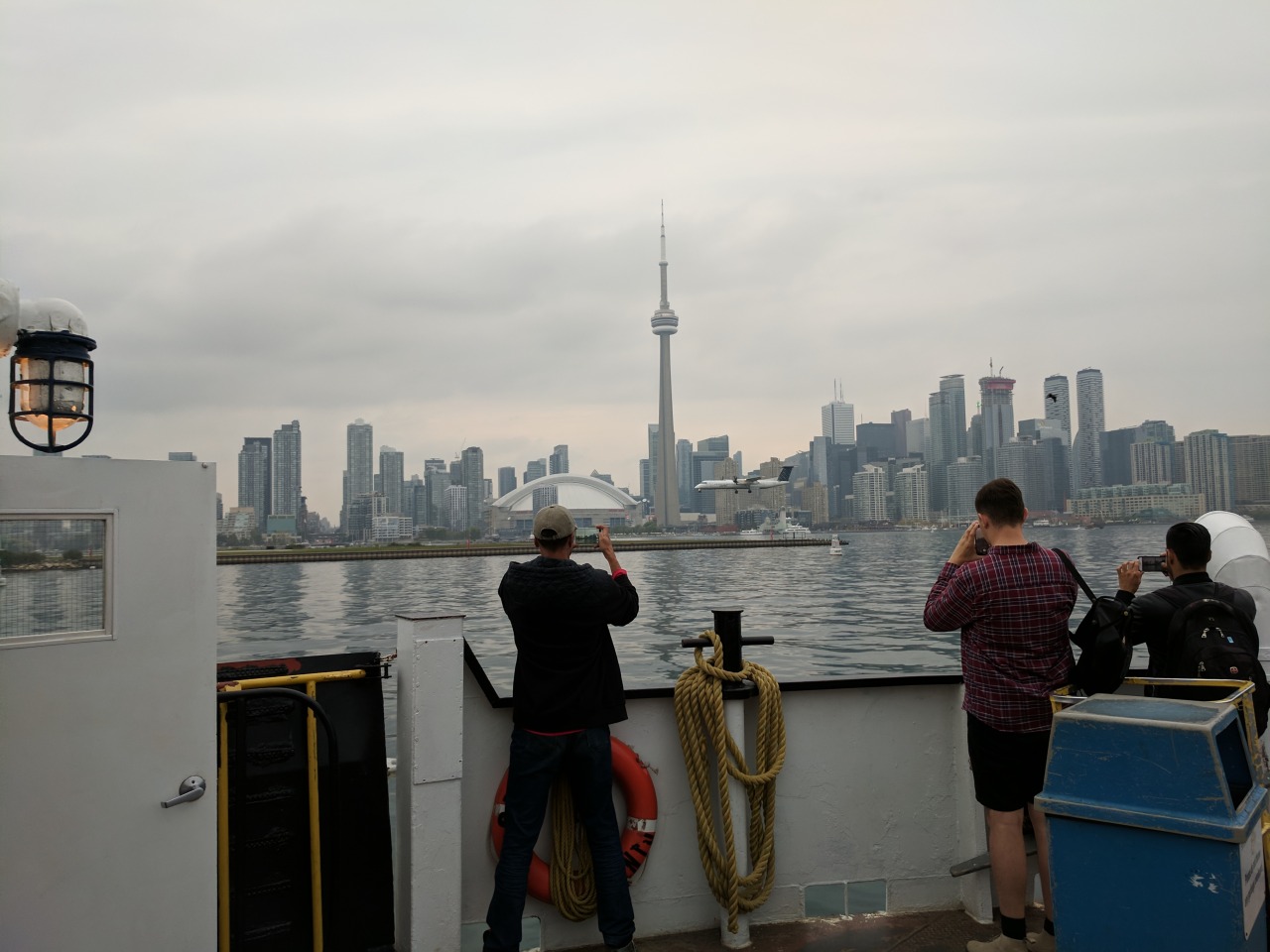
The last stop was the Rogers Centre, and the CN Tower. Neither were especially interesting, but there were a bunch of old trains to play with and I got to walk on a skybridge to get to the subway.
With only a couple of hours left until the concert I went back to my room to change and recharge my batteries.
Travelling right round the world to see two of my favourite bands play on the one night
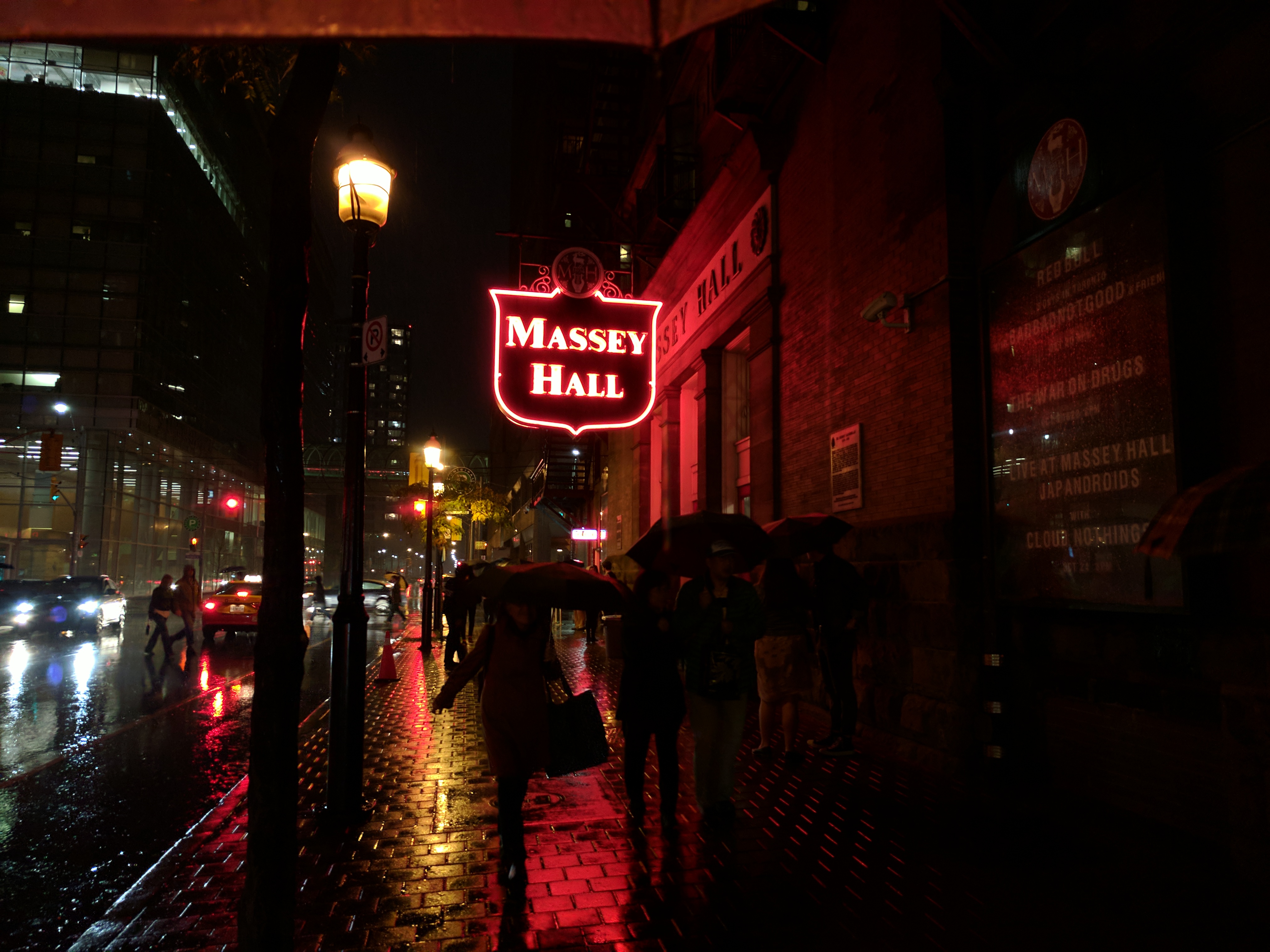
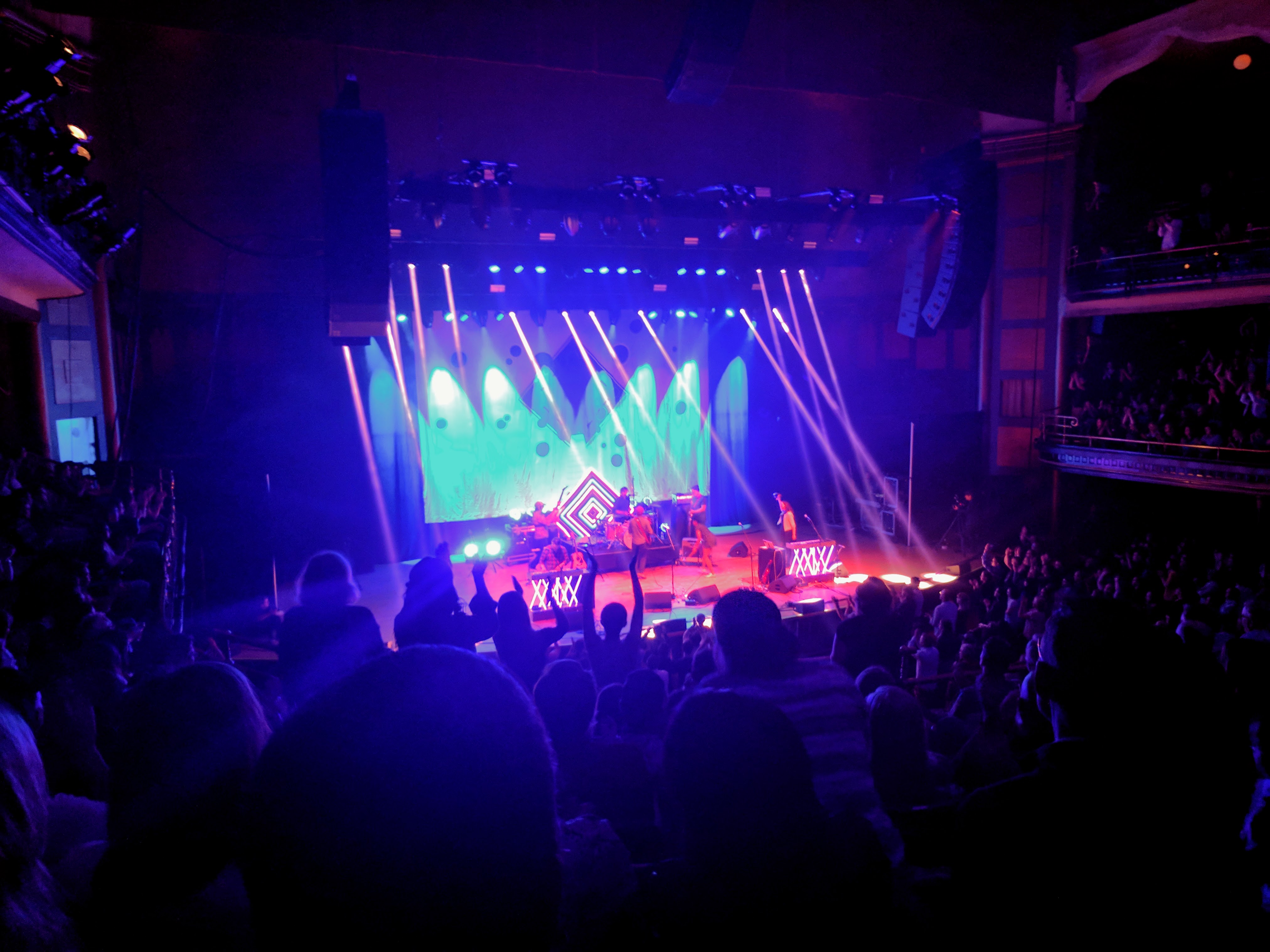
The concert itself blew me away. Massey Hall, built in 1894, was an incredible venue. Though it was all seated and wasn’t conducive to dancing, the calibre of the performances was just awesome.
Born Ruffians were one of my favourite bands for a period, but I wasn’t sure what to expect from them live. They were stellar. They gave a tight performance, had a super clean sound, and it was really well done.
Apparently they have a new album coming out which I’m really looking forward to. Here’s something from the old one: Oceans Deep.
The New Pornographers are wild; between three guitarists, two keyboardists, four vocalists and a strategic violin-percussionist they put on a great show.
The sound was a bit hit and miss with a few malfunctions, but it was still enjoyable and they know how to please a crowd.
My favourite bit was probably Simi Stone, touring member, singing Play Money — a song I can’t a good copy on Youtube anywhere (2022 update: here’s a nice one). Instead, here’s another I like: This is the world of the theater.
A food tour of Toronto
October 19th, 2017 10:39am
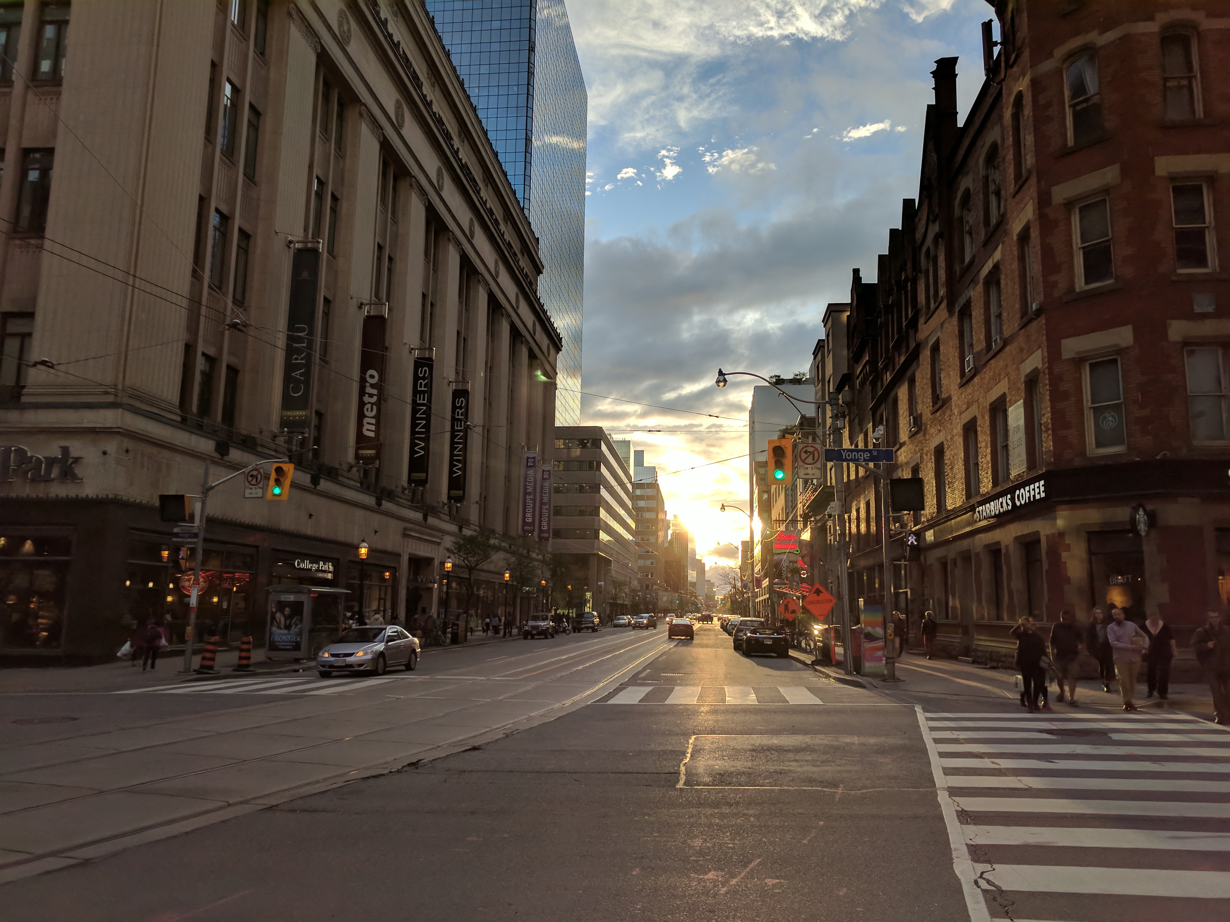
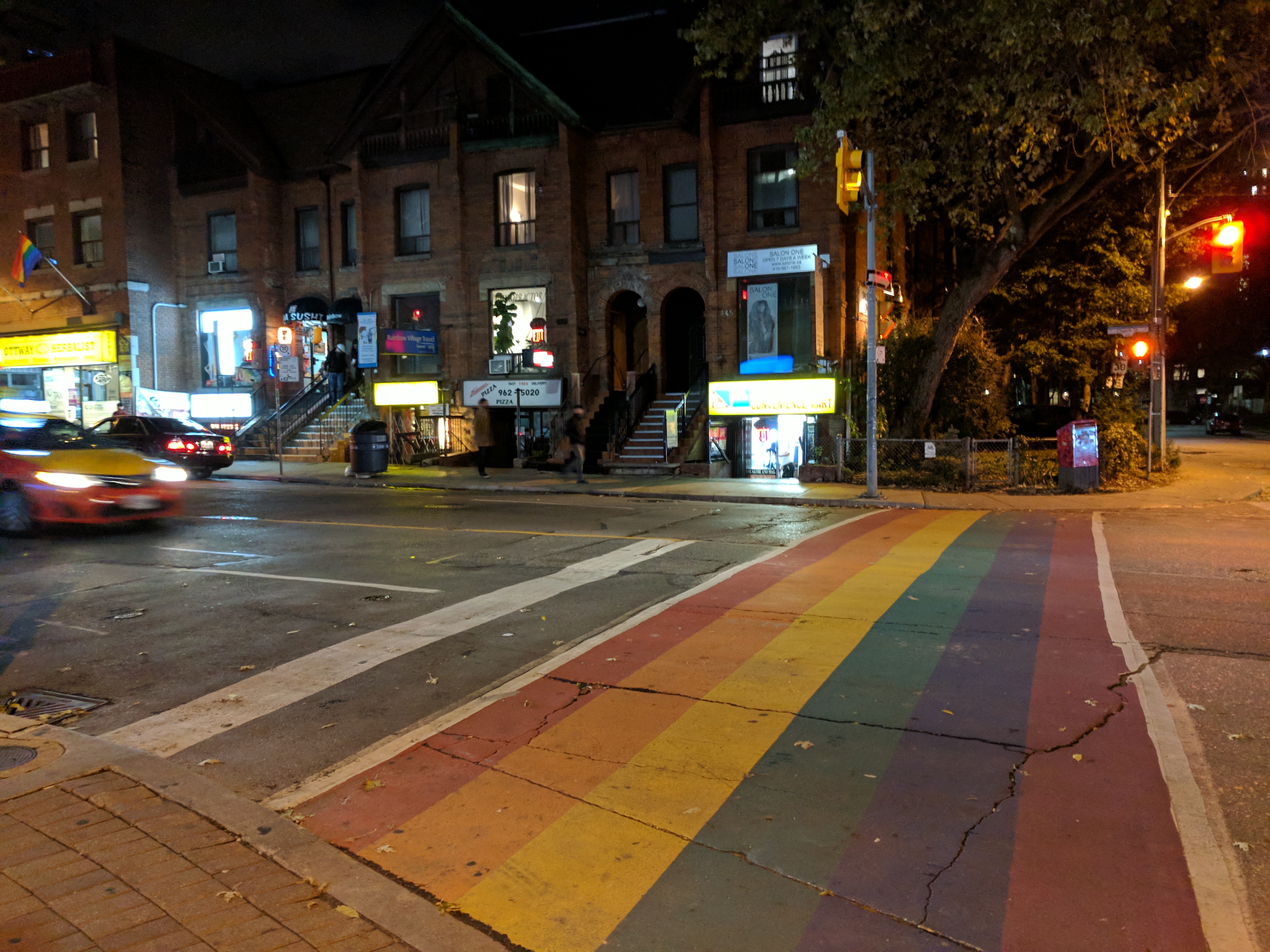
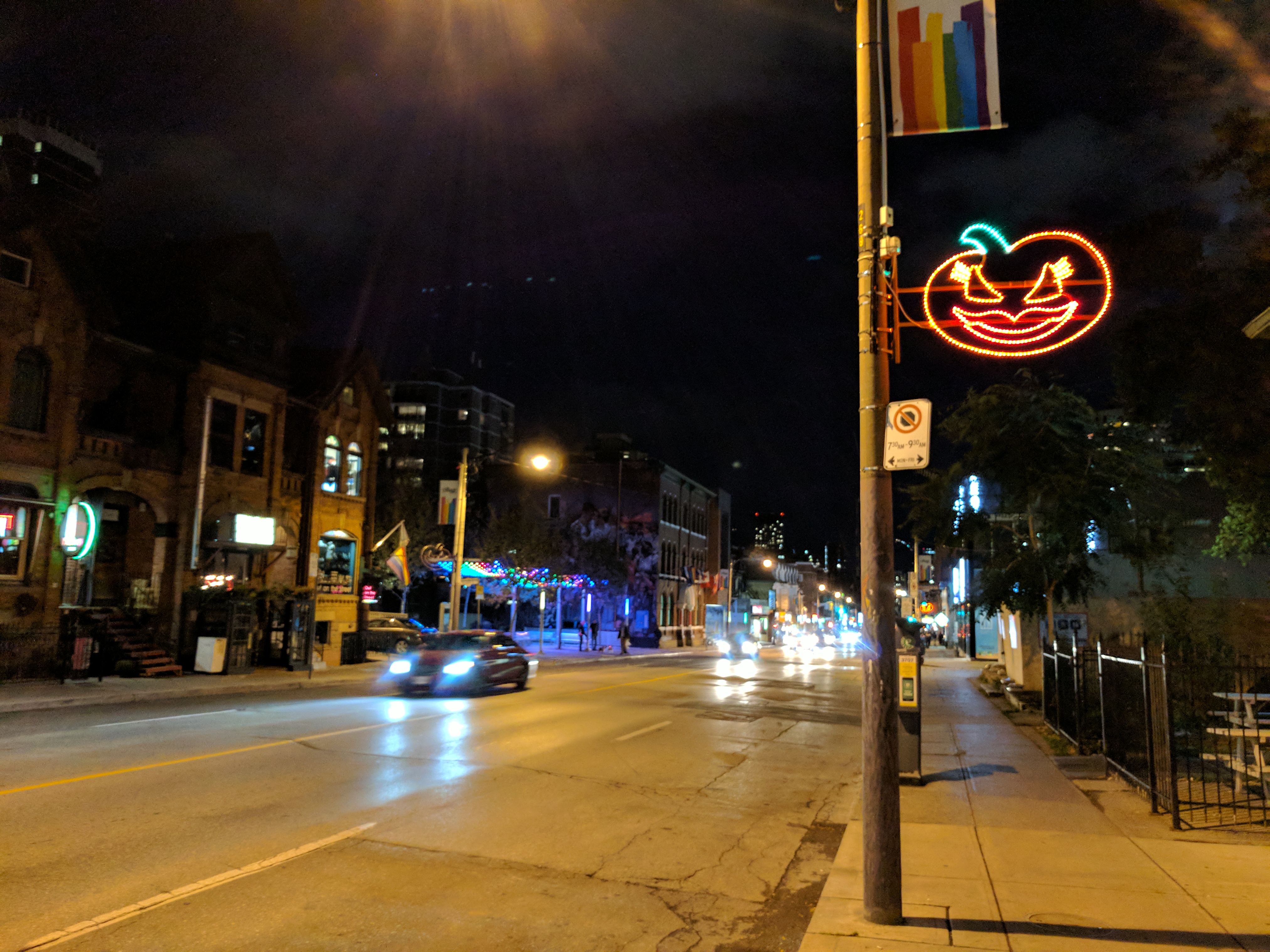
I took some time out to be a lazy bum the last few days in Toronto.
My “feeling a bit out of sorts” in London turned out to be a cold, which wasn’t super bad but rapidly moved to my shitty, asthmatic chest as these things do. So I spent the day lazing around eating Pop Tarts, a local delicacy which I understand are only legal to buy in North America.
When the sun went down I caught up with a new friend Mx who took me for sushi then showed me around the neigh(gay)bourhood. We later went for Poutine, which was an excellent, terrible mistake and I don’t know if I’ll be able to eat again.
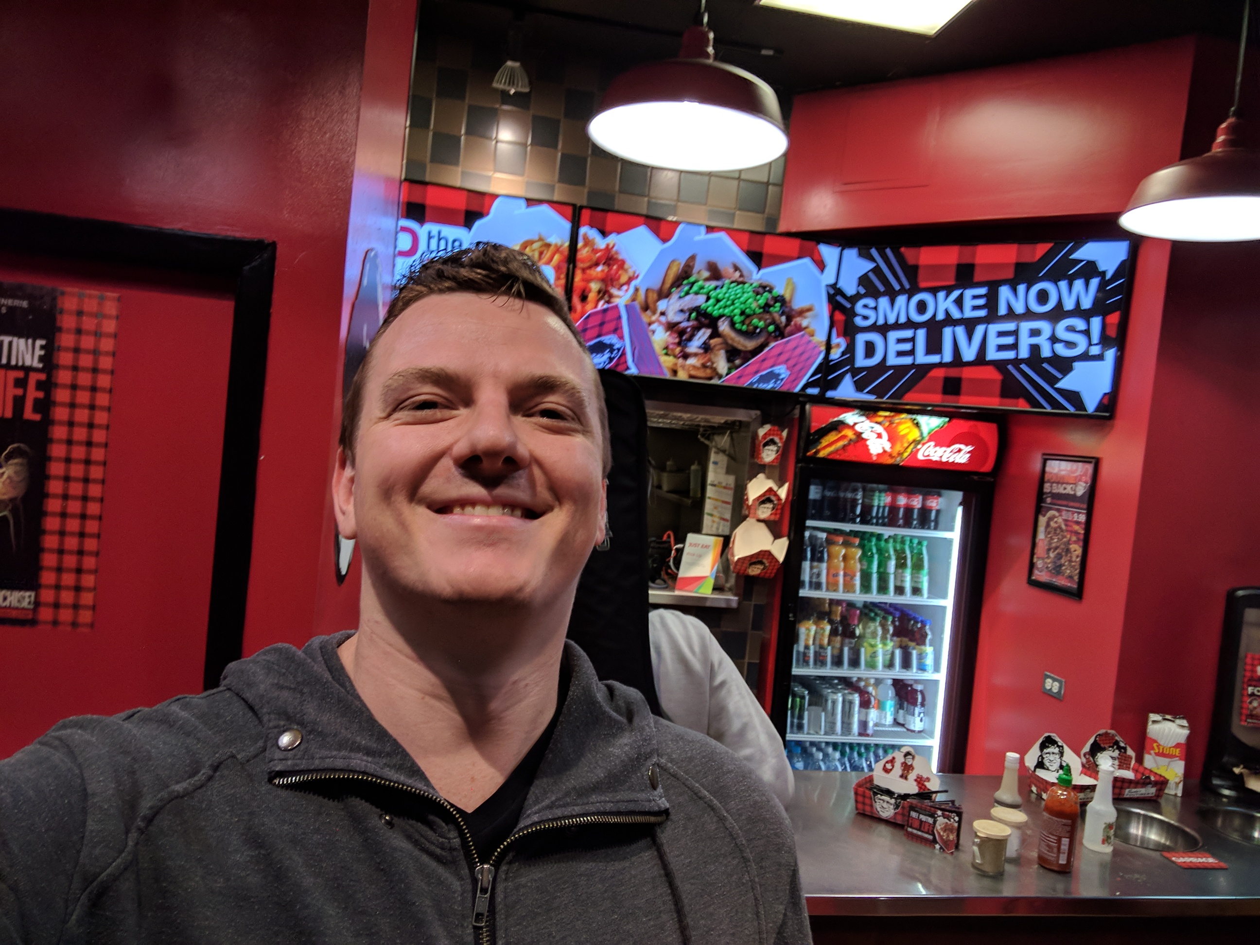
The next day I went and caught up with the Vox Pop folks (who do Vote Compass). They’re doing some really cool stuff, and it was fun to see what goes on behind the scenes. I was super embarrassed to have a coughing fit in their tea room, apparently I was talking too much.
After that it was time to head to the airport.
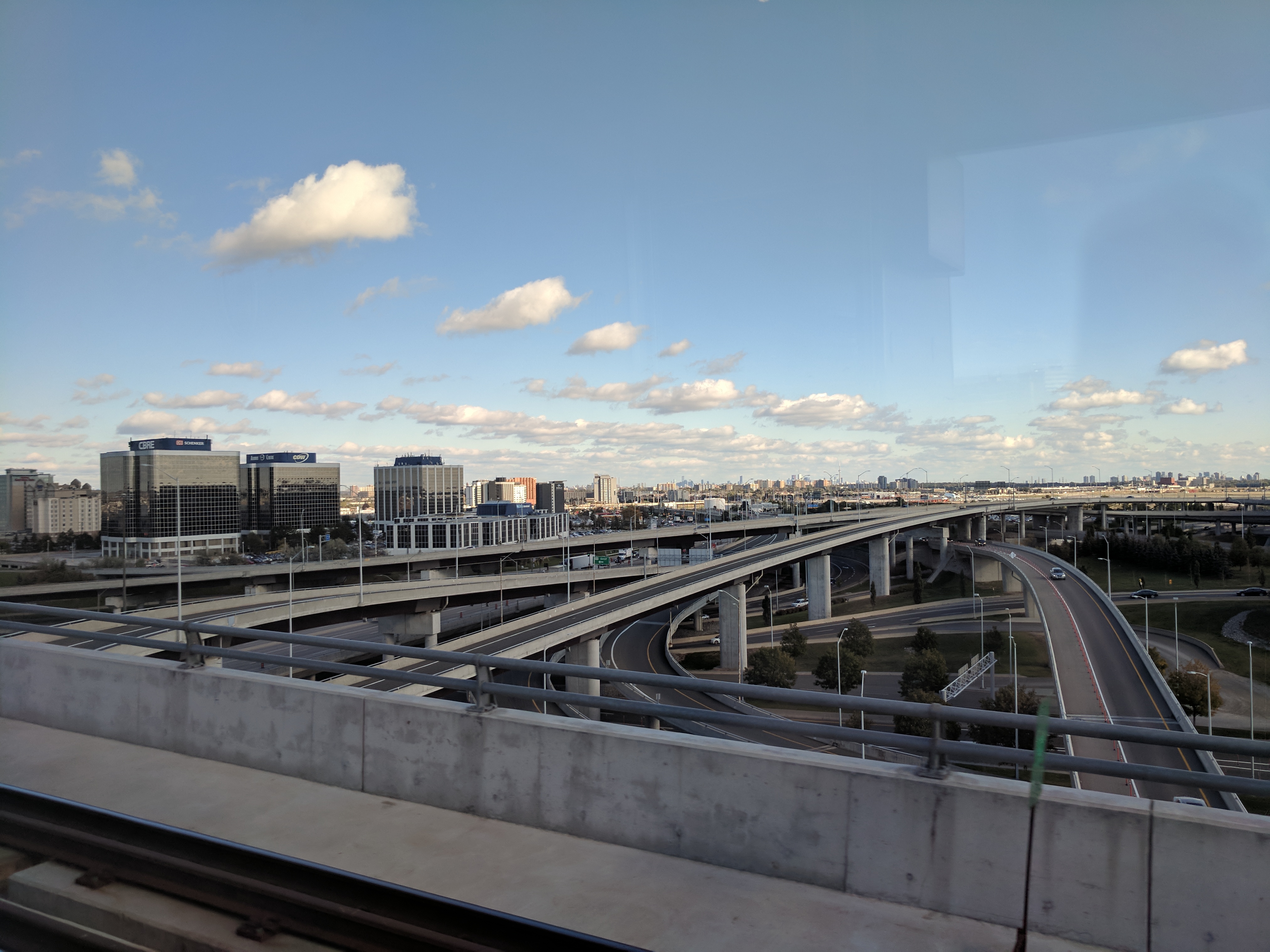
See ya Toronto ya filthy, charming mess!
Vancouver
October 19th, 2017 8:30pm
Air Canada is more generous/sensible with their carry-on luggage quotas, so I didn’t have to check my bags and went straight from plane to train!
Vancouver was decidedly more wet than any other cities I’d visited, it was bucketing down when I got off the metro. Luckily my Airbnb was only a few blocks from the station.

Nice headphones! I finally got around to reviewing them on the plane.
There’s a 3 hour difference between Toronto and Vancouver, and 10 hours difference from Amsterdam so the incremental changes were starting to catch up. I went to bed early, and was disappointed to find I’d woken at 6 AM.
It was a lovely, sunny day for an adventure so I headed out in the direction of Stanley Park with the intention to hire a bike.
After getting myself all mixed up and walking the dead wrong way for a bit (my internal compass is not calibrated for the northern hemisphere), I stumbled upon Urban Waves bike hire where I rented a fetching mountain bike named Norco.

Stanley Park is a peninsula to the north of Vancouver devoted to parkland. There is a seawall around the perimeter which is devoted to pedestrians and cyclists to tour the area.
From Wikipedia:
The land was originally used by indigenous peoples for thousands of years before British Columbia was colonized by the British during the 1858 Fraser Canyon Gold Rush. The land was later turned into Vancouver’s first park when the city incorporated in 1886.
So I set off on my bike, stopping every few hundred meters to marvel & take photos. Vancouver is a very pretty city, especially in fall when the leaves are starting to turn.
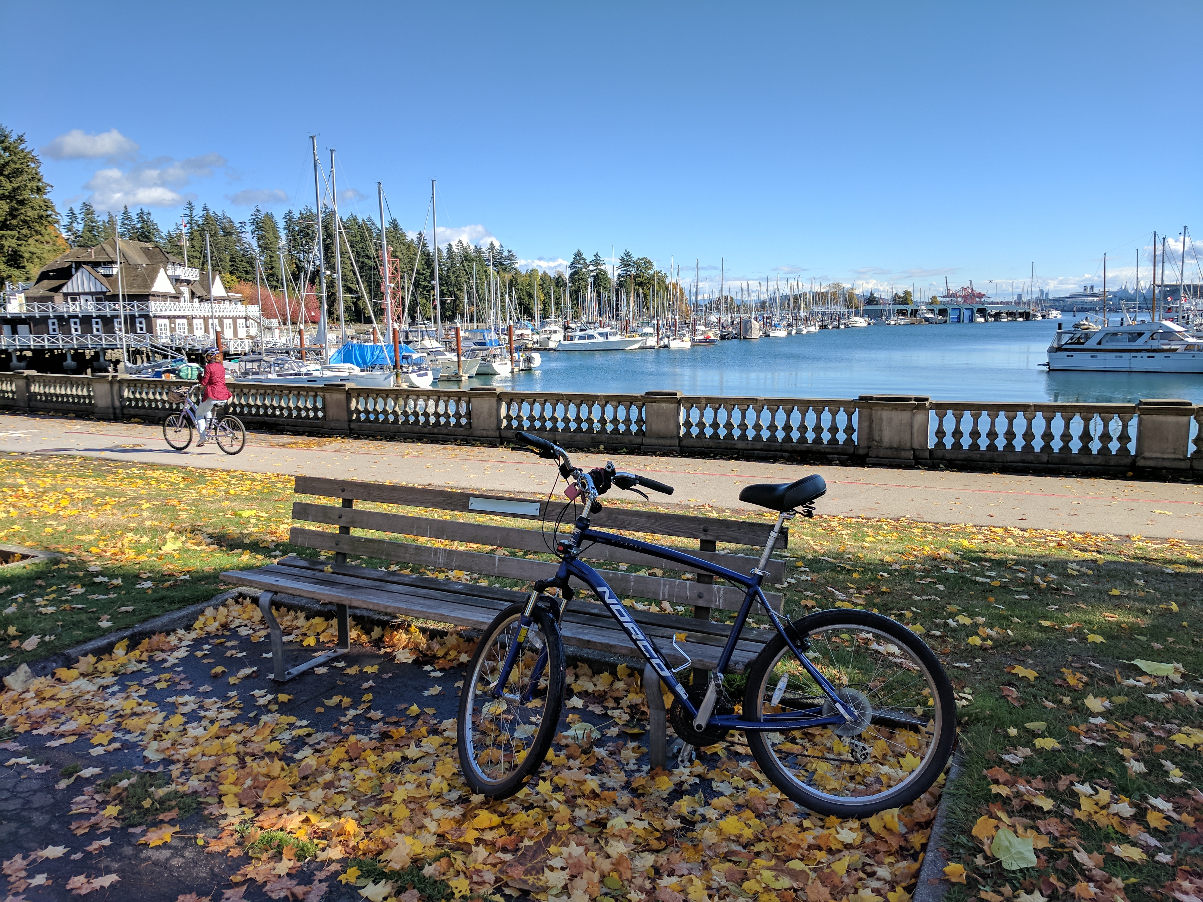
The ride is fascinatingly varied, ranging from city to harbour to the shipping lanes, a little beach, then back to the start via a Rhododendron Garden. It’s a painfully beautiful touristy thing to do, and I would recommend it for anyone who can ride a bike.

After that I stumbled on a local cafe chain and my life changed forever.
Let me cast my mind back to the year 2004 when I was a student living in Highgate Hill with two other housemates possessing equally terrible tastes in everything. On very special occasions when we were up early enough and could be bothered enough, we would trek down the hill on a 20 minute pilgrimage to the Crepe Cafe in South Bank for a $2 breakfast. It was glorious..
Over the years the price of breakfasts went up. First to $3, then to $5, and eventually breakfasts were the same as any other time, $7.50 for an Aussie Sunrise crepe (bacon, egg, cheese and spring onion). Still a bargain if you ask me.
In 2015 when I was working in South Bank, my colleagues would hate going to the Crepe Cafe for lunch because it really wasn’t value for money and tbh it was pretty gross food. But it held a special place in my heart (and it had a gluten free option so Gav would always be excited to come with me).
In 2017 tragedy struck and the Crepe Cafe closed its doors, never to be opened again. It was like a little piece of my youth had been torn away.
So when I saw that there was a Cafe Crepe in Vancouver, I was pretty excited.
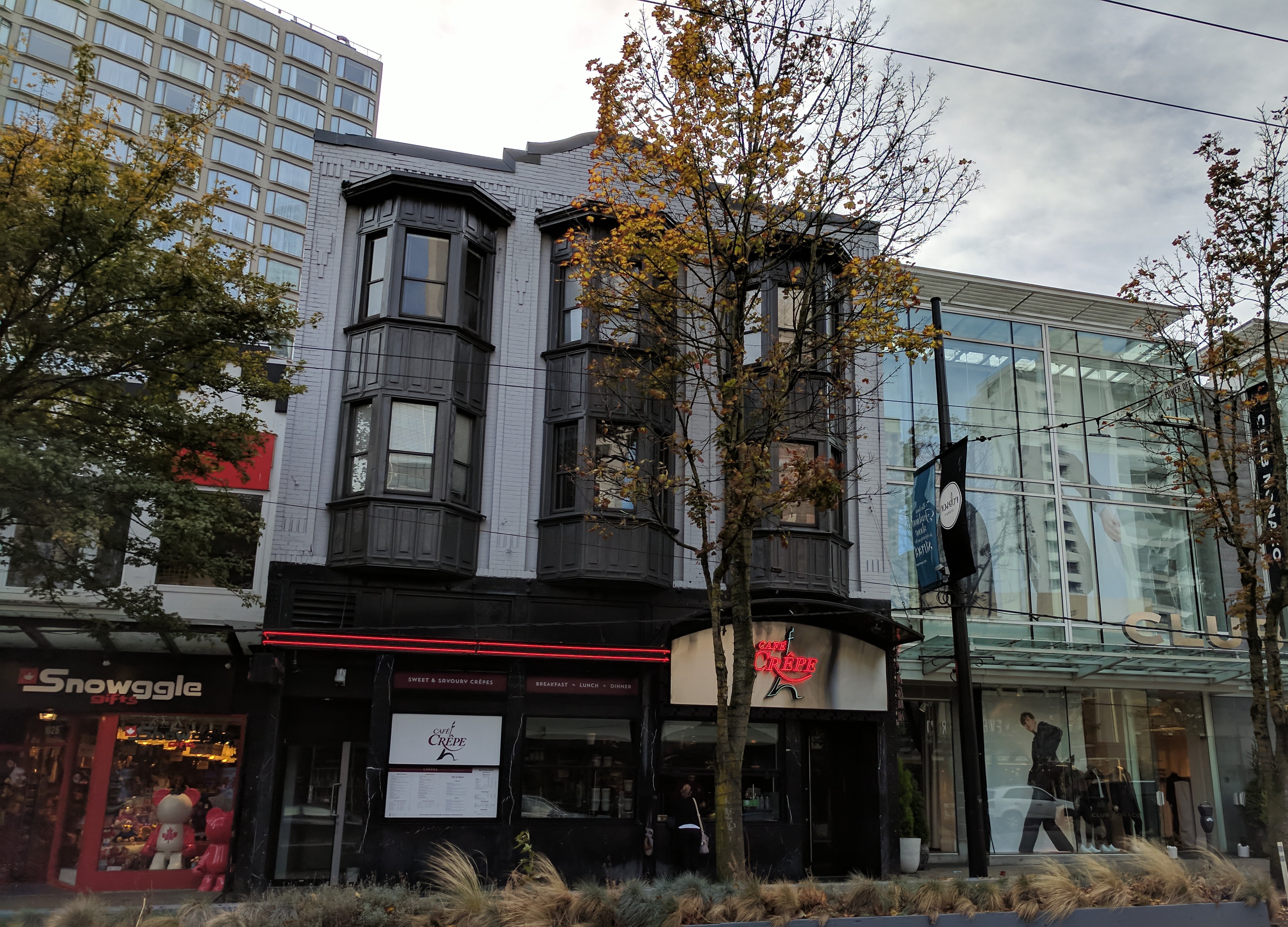
It was a little piece of nostalgia, and branding aside felt exactly like the Crepe Cafe I knew and loved. I had a roast chicken crepe with a Pepsi Zero, and for a moment everything in the world was good again.
After the fleeting joy dissipated, I tipped 20% and left.

The next day was rainy as heck, so I wanted to find inside things to do.
To start I went to Best Buy to see if I could find a nice Chromebook (I couldn’t). After that I went to Cafe Crepe and ordered a ham and cheese crepe with a Pepsi Zero.
After that, having exhausted my list of things to do, I jumped on a metro train to see where it would take me.
It took me to Waterfront, which is kinda the interchange for all the trains, metros and trolley buses with the cruise liners, ferries and helicopters. It was a super impressive sight, made even better by my accidentally stumbling on the Vancouver Lookout tower which takes you up a big ol’ elevator to a viewing platform where you can see everything.
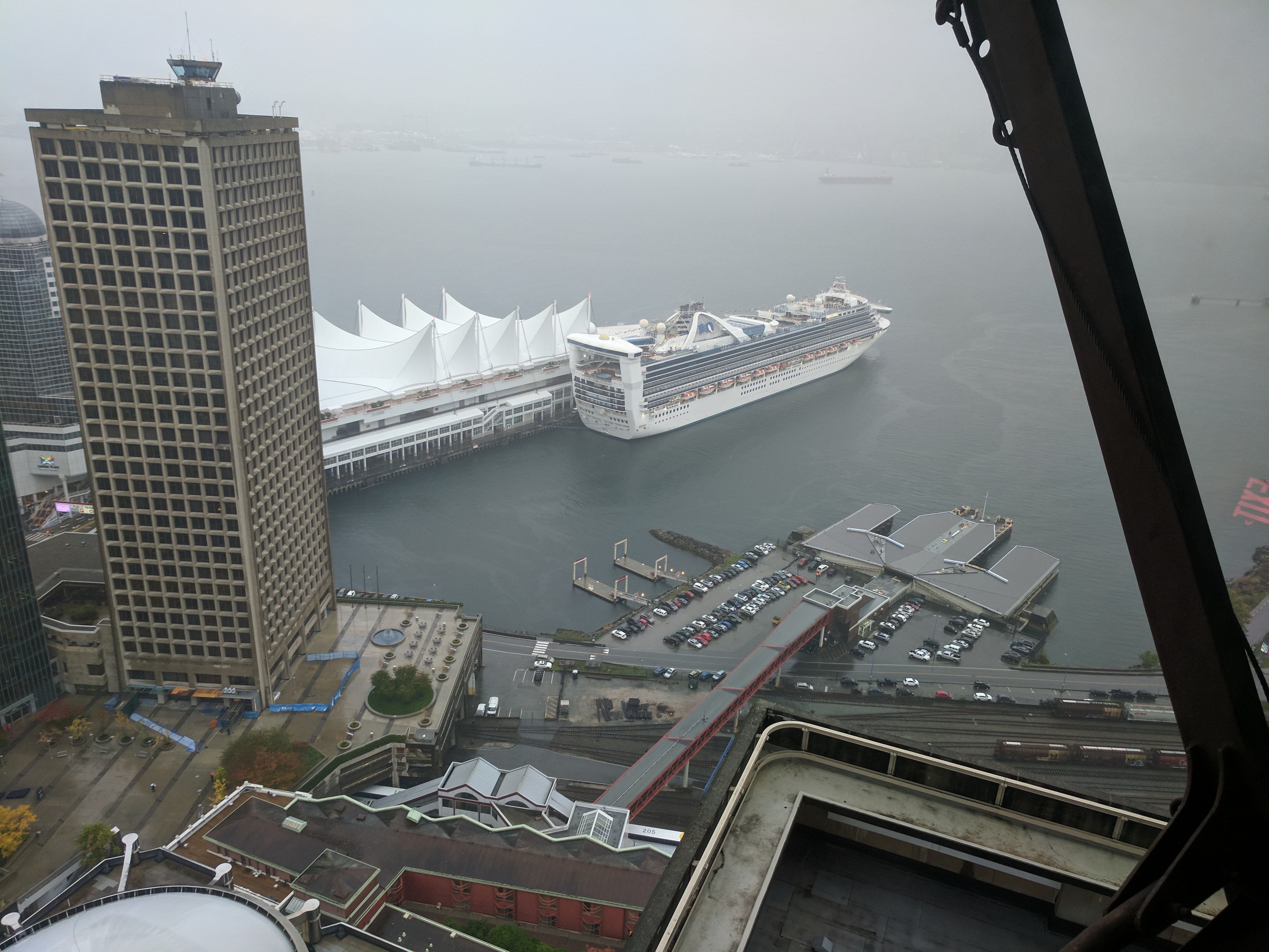
I don’t have any good pics, but here’s a part of a photosphere that shows the cruise liner, a ferry coming in, a bunch of trains, and the helipad behind the beam in the center. I thought it was awesome.
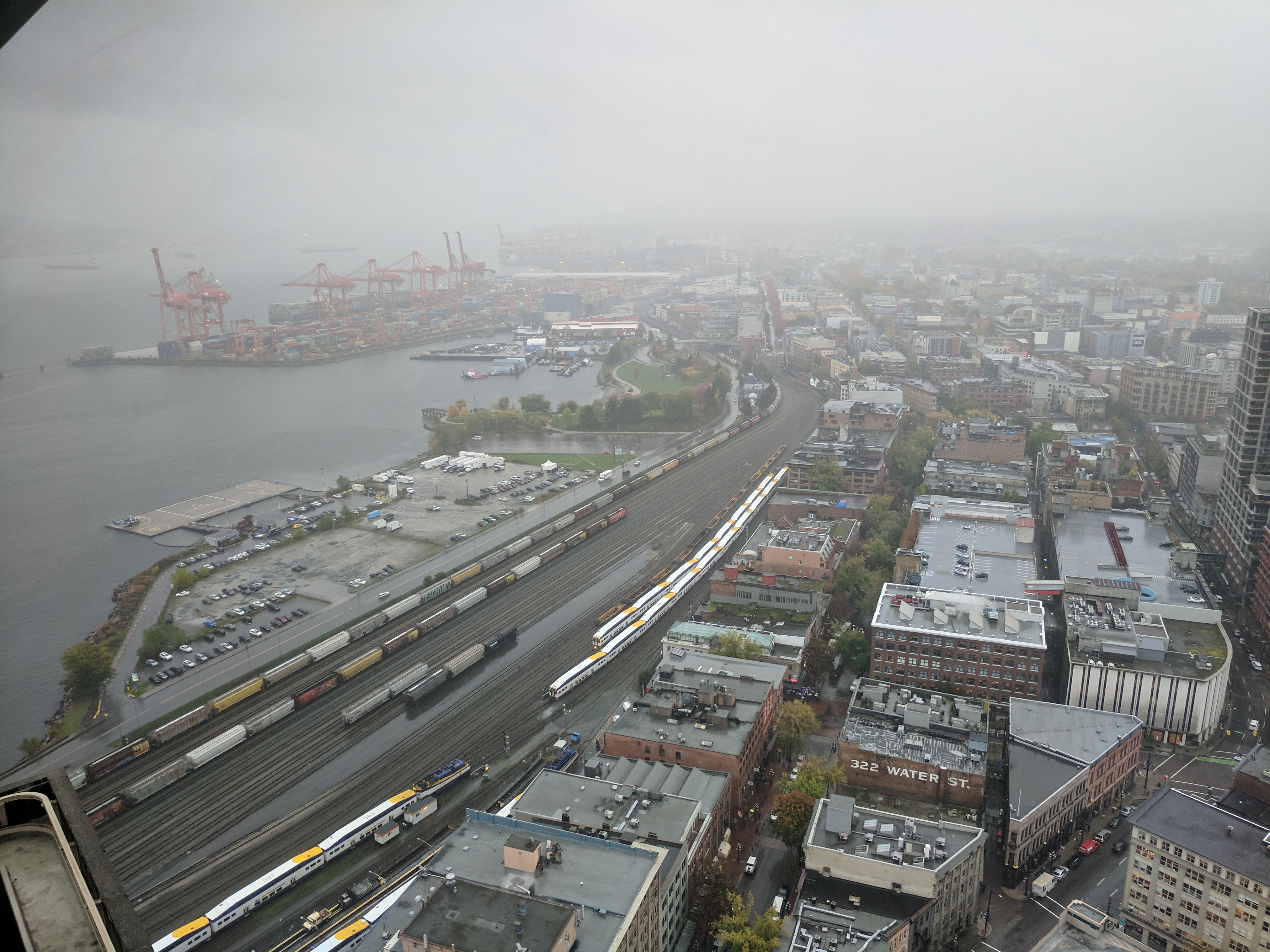
After this I caught a trolleybus to who knows where. It was a bit of a mistake because it took me out to Gastown which is usually lovely but was basically a river at this point. I grabbed a slice of pizza and a Coke Zero to get out of the rain but there was no end to it so I walked back to the station with my increasingly dilapidated umbrella.
By the time I got back to my Airbnb my shoes were drenched through, my jeans, jumper and t-shirt were varying degrees of soaked. I’d basically had enough of this whole exploring thing, and vowed never to go outside again.
With only one more day until my holiday was over, I was both pensive and relieved. It’s been lovely, but I can’t wait to sleep in my own bed again
Wet shoes, heavy soul, the last day
July 13th, 2018 8:30pm
It’s been weighing on me that I never actually wrote about my last day in Vancouver on here. I sort of did on my blog elsewhere but it feels like things are incomplete.
The last day was weird, I don’t know if it was timezones or the calendar or what but I thought I was going home much earlier than I actually was. So I took a walk, randomly following points of interest on Google Maps.
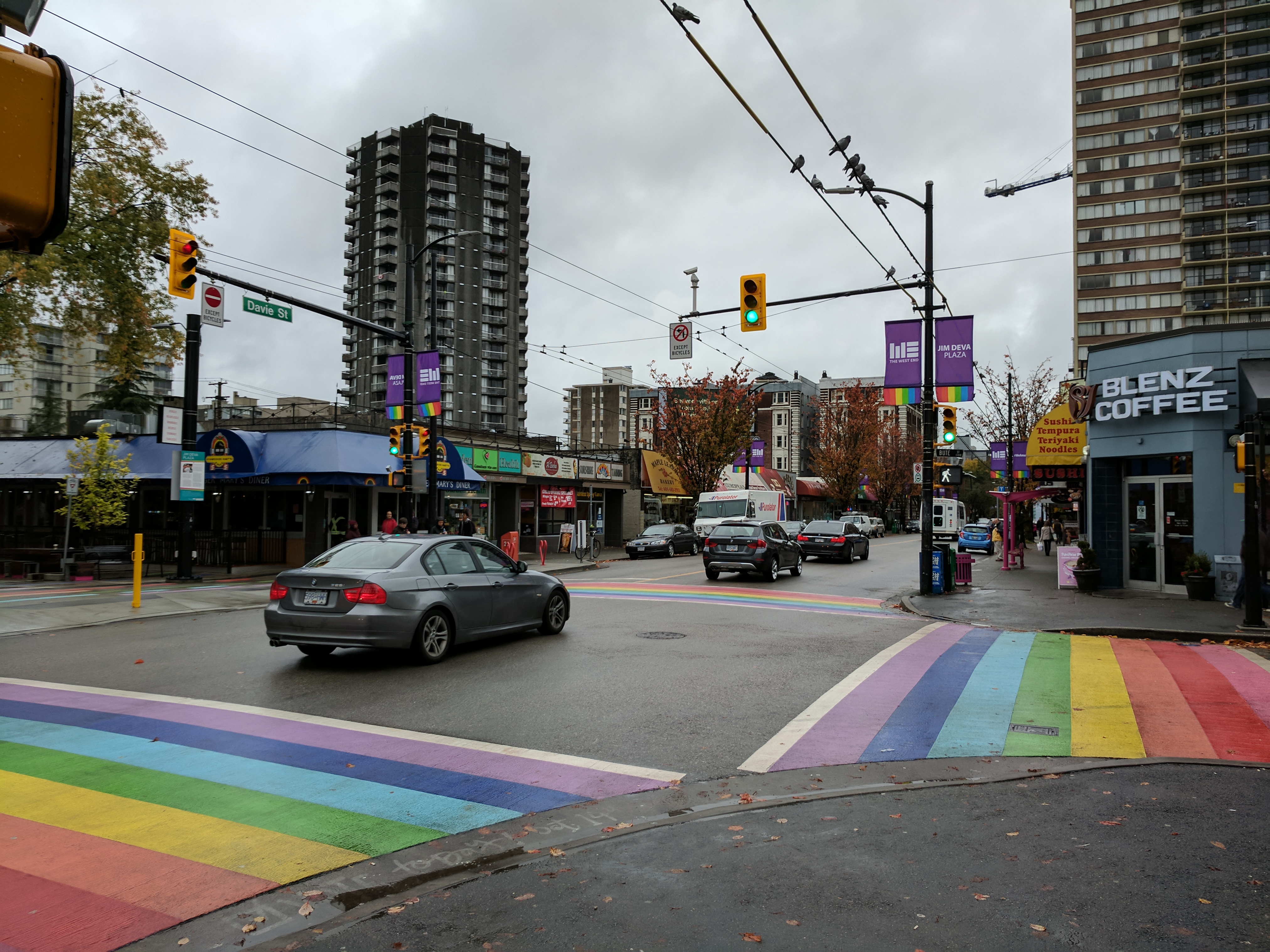
One of my first landmarks was the Davie Street rainbow crossing which I stumbled on by accident and it really messed me up.
I don’t know if it was the post-holiday blues or what but the thought of coming back to Australia in the midst of the Coalition’s reprehensibly “postal survey” was desolate. I might have cried in the rain at one point.
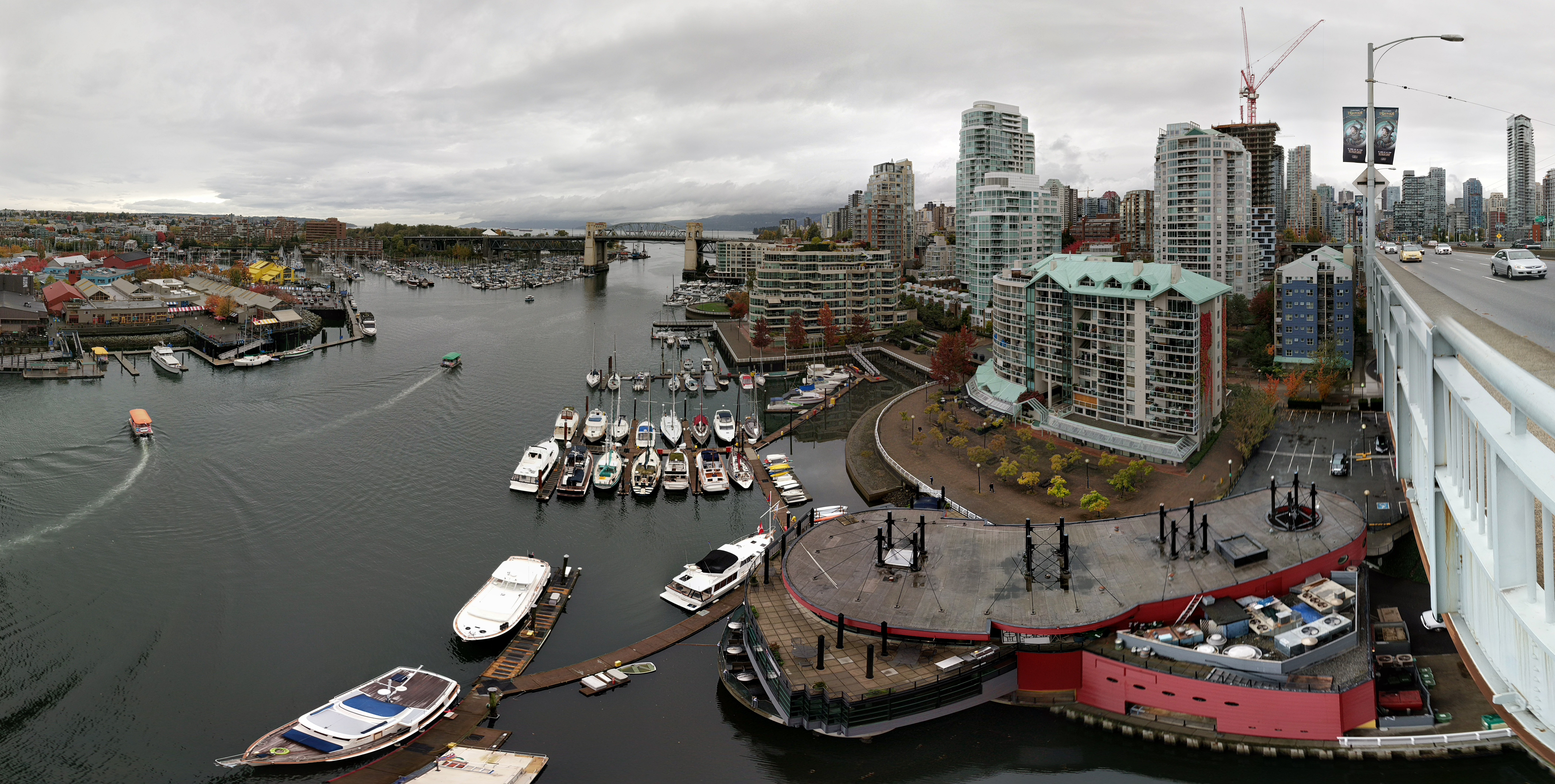
My walk took me down to the water, across the Granville Bridge, and all the way along False Creek to the science center, where I took the train back to my Airbnb and bought some new shoes since mine were completely soaked through.
The flight home was comfortable, with the though of being in the middle of the Pacific Ocean only vaguely terrifying. The soundtrack was Cut Copy’s Haiku From Zero (no fixed destination), which I think I will forever associate with that trip. The end.
