Fit a MapLibre 3d globe to the available screen size

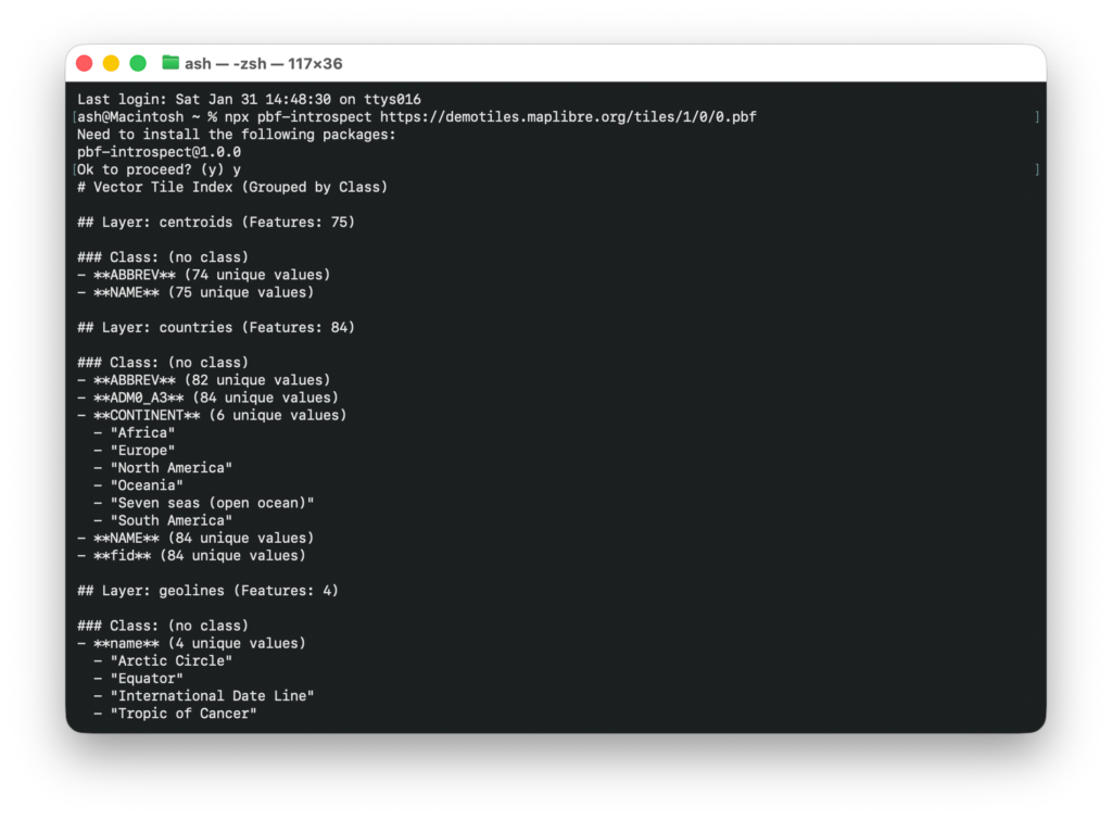
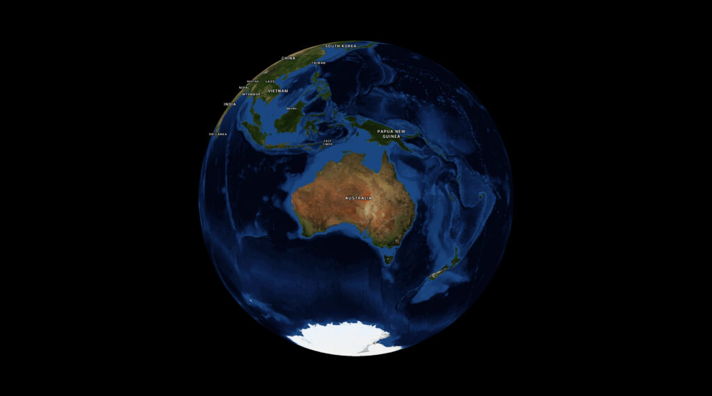
MapLibre introduced a globe mode, which is really cool. But one thing I had a lot of trouble with was making the globe take up all the available screen space without either overflowing or leaving a bunch of whitespace at the sides.

Initially I thought I could call fitBounds with the coordinates on each corner of my globe, but that only worked at latitude 0; once we started panning and zooming around the calculation would break down. This is for several reasons:

  1. firstly, I was calculating coordinates based on the longitude, but for the latitude I’d just stuck the two poles in, figuring the top and bottom of the map would do. But the poles get visually closer together when you change the latitude. No good.
  2. in MapLibre the zoom level (z) affects the map differently depending on your latitude. So at the poles, you need to have a super zoomed out z value to see the same amount of globe as you do at the equator. This means you have to calculate the zoom value every time the latitude changes.

This turned out to be too hard and I’d given up a few times, until I started messing around with Antigravity trying to tune my bad algorithm.


Every so often the LLM manages to do something that I would not in a million years. This is something I’ve been agonising over, and with a bit of iteration the damn thing did it with plain maths and known values:

    function fitTheGlobe() {
      if (!mapRoot.map) return;

      const container = mapRoot.map.getContainer();
      const width = container.clientWidth;
      const height = container.clientHeight;

      // 1. Determine how big (in pixels) we want the globe diameter to be on screen.
      const padding = -20; // visually tweak to fit
      const targetDiameterPx = Math.min(width, height) - padding * 2;

      // 2. MapLibre's zoom logic is based on a Mercator projection, which stretches
      // the world as you move away from the equator by a factor of 1/cos(latitude).
      // To keep the globe a constant physical size, we must shrink our target
      // dimensions by cos(latitude) to counteract that internal magnification.
      const lat = mapRoot.map.getCenter().lat;
      const latRad = (lat * Math.PI) / 180;
      const mercatorScaleCorrection = Math.cos(latRad);

      // 3. Calculate the necessary world circumference (in pixels) to achieve
      // our target diameter. On a sphere, Circumference = Diameter * PI.
      const requiredWorldCircumferencePx = targetDiameterPx * Math.PI * mercatorScaleCorrection;

      // 4. MapLibre defines Zoom 0 as a world circumference of 512px.
      // Each zoom level doubles the pixel size (exponential growth: 512 * 2^z).
      // We use Math.log2 to convert that pixel growth back into a linear zoom level 'z'.
      const targetZoom = Math.log2(requiredWorldCircumferencePx / 512);

      const currentZoom = mapRoot.map.getZoom();
      const threshold = 0.01;

      if (Math.abs(currentZoom - targetZoom) > threshold) {
        mapRoot.map.flyTo({
          zoom: targetZoom,
          duration: animationDuration,
          essential: true
        });
      }
    }

I prompted it to split the calculation out and document what’s happening and I think this is a pretty accurate take. The conditional at the end guards against rounding errors and jitter. The vibes feel good.

A 3D globe with Nasa's Blue Marble satellite imagery wrapped around it, showing Australia, bit of Asia, Antarctica, and New Zealand (weirdly, usually maps don't show New Zealand).

Look, I don’t fully understand the maths, and there’s a bit more padding the bigger your screen gets. But deeply understanding this is not necessary for me to get my work done so I’m fine with that.

Ultimately it would be nice to have a built-in function in MapLibre, and if I get a moment I’ll see if I can wrap my head around it enough to make a PR back upstream. In the meantime, I hope this helps.

Dealing with Missing Glyphs in MapLibre

I’ve been working with MapLibre a lot recently, and every so often I come across a weird bug. This one was particularly annoying; our corporate font doesn’t have the glyphs required to render certain characters. Rolling around the map I’d spot places like Vit Nam (Việt Nam), and Smoa (Sāmoa), and put it on my to-do list to deal with later.

Well, now is later. And I have to find a fix.

My first thought was that we were possibly using the wrong place names. My second thought was to change the field we take names from. I don’t recall what the default was, but changing it to name:en was enough to get most labels rendering properly.

However Samoa was stubborn; I was still getting “Smoa”, and had to do some investigation to work it out.


What’s in a tile?

Web maps use tiles to break up data downloads, and modern ones use the pbf (protocolbuffer format) rather than PNGs or JPEGs. PBFs give you vector data so you can style your maps on the frontend.

My first step was to determine if the issue was in the data itself, or the rendering. I identified the specific pbf tile by zooming right in on Samoa and picking a random one out of the network tab, then downloaded it to inspect.

Since I don’t have time for this, I got the AI to write a script to list the properties the renderer could use, using  @mapbox/vector-tile:

import fs from 'node:fs/promises';
import Pbf from 'pbf';
import { VectorTile } from '@mapbox/vector-tile';

const data = await fs.readFile('tile.pbf');
const tile = new VectorTile(new Pbf(data));

// Inspect the 'place' layer where country labels live
const layer = tile.layers.place;

// Find the feature by ISO code using a functional approach
const samoa = Array.from({ length: layer.length }, (_, i) => layer.feature(i))
  .find(f => f.properties.iso_a2 === 'WS');

if (samoa) {
  console.log(JSON.stringify(samoa.properties, null, 2));
}

This filtered through the features and printed every property available on the country object, which I think will be useful for all kinds of other styling purposes. The output, truncated:

{
  "class": "country",
  "iso_a2": "WS",
  "name": "Sāmoa",
  "name:am": "ሳሞአ",
  "name:ar": "ساموا",
  "name:be": "Самоа",
  "name:bg": "Самоа",
  "name:br": "Samoa",
  "name:ca": "Samoa",
  "name:da": "Samoa",
  "name:de": "Samoa",
  "name:el": "Σαμόα",
  "name:en": "Sāmoa",

In this specific tile set, every common English fallback property contained the non-ASCII character ā. Since our custom brand font didn’t include a glyph for that character, MapLibre dropped it leaving us with “Smoa”.


So like, ok now what? Search & replace for MapLibre labels

Since I have no control over our font or tiles, I needed to rewrite the label on the fly. I hoped I could use some kind of string replace function to turn the mācron characters into the standard letter a, but MapLibre expressions don’t have a string.replace() function.

Fortunately, for countries, we can write MapLibre expressions using the ISO country code (iso_a2) to replace the label value:

const nameFallback = [
  'coalesce', 
  ['get', 'name_en'], 
  ['get', 'name:en'], 
  ['get', 'name:latin'], 
  ['get', 'name']
];

layer.layout['text-field'] = [
  'case',
  // Is this a country label?
  ['==', ['get', 'class'], 'country'],
  [
    'match',
    ['get', 'iso_a2'],
    'WS', 'Samoa',            // ASCII rewrite for Sāmoa
    'CI', "Cote d'Ivoire",    // ASCII rewrite for Côte d'Ivoire
    'ST', 'Sao Tome and Principe',
    nameFallback              // Default country fallback
  ],
  nameFallback                // Default for cities, towns, etc.
];

I’m using Javascript to search through an existing style.json and set values. But you could just as easily implement a short list of hard-coded countries directly in your style.json. Not a great solution, but a band-aid to get us by for now.


As an addendum, I found the ability to introspect PBF files was a super useful debug tool, especially when writing niche styles by hand. So I turned the script into a little npm package that you can run for any remote url:

It’s kind of a game changer, just run npx pbf-introspect https://someurl and get all* of the properties straight back. The json output is also handy to prompt your robot coworker, if you have one.

How I rolled my own vector map tiles

OpenStreetMap is like the Wikipedia of maps. Back in the earlier days I used to love running around gathering data and mapping every neighbourhood I could.

I reckon I contributed a pretty big portion of street names on the north side of Brissie, by riding around on my bike with my Nokia 6120c (great phone!) and a bluetooth GPS dongle, recording all the points of interest like a pro, to upload to the map when I got home.

It was a great hobby at the time, when vast swathes of Australia were completely blank. Now OpenStreetMap is pretty feature complete, it’s used everywhere.


A short history of maps as a web developer

Back in those days the state of the art for web mapping was the tile-based “Slippy Map”.

Everyone used it, even Google Maps. You’d essentially have a Javascript frontend to let visitors zoom and scroll the map like you do today. But on the server a process would convert all the OpenStreetMap geodata into standardised image tiles (raster tiles).

Tiles were commonly created at 256×256 pixels, and were rendered at zoom levels from 0 (the whole world in one tile) down to zoom level 19 where the world would take up 274.9 billion tiles.

A map of Australia and surrounding nations, split into a 256 pixel grid

This was generally an on-demand process as rendering so many tiles would be infeasible. Ridiculous. Absurd. I can tell you this because I tried a couple of times. Not for the whole world, but a few times I’d tried to scrape, render, cache the entire of Brisbane for assorted projects.


Eventually Mapbox came along with an easy-to-use interface on top of the open source data, and reasonable enough pricing to make it worth switching over.

I gave a talk a decade ago about the cool stuff people were doing with maps, and that included plenty of Mapbox evangelism.

Later Mapbox standardised the Mapbox vector tile format which had a lot of benefits over the older raster tiles.While a raster tile could be styled to look however you want on the server, a vector tile could be styled on the client-side. That meant the same tile could power a hundred different map styles, even dynamically on the client-side. In addition, vector data makes things like animating between zoom levels look great. Generally, a huge step forward.

The new OpenGL map library was released to take advantage of these benefits and it unlocked a lot of really high quality maps for the masses.

By this point high quality maps were par for the course and radical innovation in the space kind of flattened out.

My opinion of Mapbox turned when they went the way of every venture backed startup; got involved in union busting, closed-sourced their tools and started turning the money dial up. 

That’s when I started playing with maps again.


Cycling maps

Since at least 2010 I’ve maintained briscycle.com in some form or another, and always one of the main features has been maps to show safe routes and how infrastructure connects up.

I’ve gone through phases of running my own tile server, using statically rendered tiles, and third party map services including Mapbox (who can’t do very good cycling maps fyi). But recently I figured I’d go back to rendering my own.

I don’t remember where I spotted tilemaker, but it has such a sweet looking website that it inspired me to have a go at building my own vector tiles. It wasn’t as easy as the website led me to believe, but after lots of trial and error, some coding in lua to get the right properties out, I managed to get a decent looking cycling map out of it.

A map of Brisbane. It's fairly desaturated, except for the green cycleways and bike lanes everywhere.

I largely followed the instructions from Wouter van Kleunen’s how-to blog post, then:

  1. extended it by customising the lua processor to pull out more cycling attributes (and skip attributes I wasn’t interested in.
  2. styled the map using a standard json map style, but I also processed that on the client-side to add more repetitive things like road casings. You can check out the code here. (edit 2024: apparently maputnik lets you create style json in a graphical way)
  3. Set up a small Docker machine to serve mbtiles (dockerfile source)

The result is pretty cool.

It’s very fast because it’s hosted in Brisbane for a Brisbane audience, so the map tiles don’t need to transit the globe before being displayed.

The tiles themselves are optimised pretty well and allow me to tweak the styles in almost real time. There’s still a few weird bits, but I reckon it’s a good base layer to add stuff to, like geojson routes (check out the brisbane valley rail trail).

So that’s it from me. You can check out the map at briscycle.com/map or check out some of the cycling trips in Brisbane for more.